GetGoing
Client GetGoing
GetGoing is one of Australia’s leading mobile health and fitness providers, redefining what accessible, personalised wellness can look like. Founded on the idea of bringing professional fitness training directly to clients, the brand quickly evolved beyond personal training — expanding into nutrition, dietetics, and mindset coaching to deliver a truly holistic approach to health and wellbeing. Today, GetGoing operates nationally with over 200+ fitness and nutrition professionals, empowering clients to achieve sustainable lifestyle transformation.
At a pivotal stage of growth, GetGoing partnered with us to refine its brand strategy and redefine its brand identity. The challenge was to uncover how the brand was perceived, where it sat within a crowded fitness landscape, and what differentiated it in the minds of consumers. Through customer research, competitor mapping, and strategic brand workshops, we sought to clarify their unique value — a brand built not just on physical results, but on real, lasting change.
From a branding and creative direction perspective, the existing identity lacked the energy, clarity, and premium feel needed to match the calibre of service. Our goal was to inject renewed vitality and confidence into the brand — balancing professionalism with warmth, and approachability with performance. The new brand positioning focused on GetGoing as a premium health and fitness provider, driven by care, expertise, and results that improve quality of life.
The result is a re-energised brand that feels modern, dynamic, and credible — supported by a refreshed brand communications system and marketing framework that better connects with audiences seeking more than a workout. A brand identity built to inspire movement, confidence, and real human progress.
Brand Strategy
Our brand strategy journey with GetGoing began at the roots — diving deep with the founders, leadership team, and their valued clients to understand the brand from every angle. Through a series of strategic workshops exploring brand positioning, competitor mapping, and customer perception, it became clear that GetGoing’s potential was largely untapped. There was so much opportunity waiting to be unleashed — a chance to expand beyond fitness into a complete health and wellness ecosystem. The goal was clear: turn the tap on, full blast.
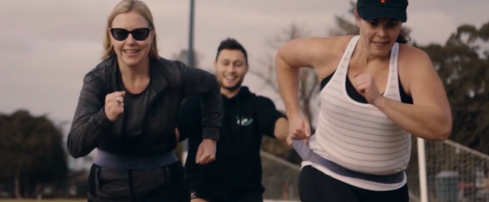
The key challenge was redefining premiumness — elevating how the brand communicated its true value. While many competitors in the fitness industry led with ego and surface-level aesthetics, GetGoing was different. Their offering was personal, grounded, and deeply human — one-on-one coaching built on trust and authentic connection. In interviews with clients, we heard the same story again and again: GetGoing coaches weren’t just trainers; they were mentors, confidants, even counsellors — people who listened, motivated, and cared. This level of personal connection was rare in the industry, and it became the foundation for their brand identity and differentiation.
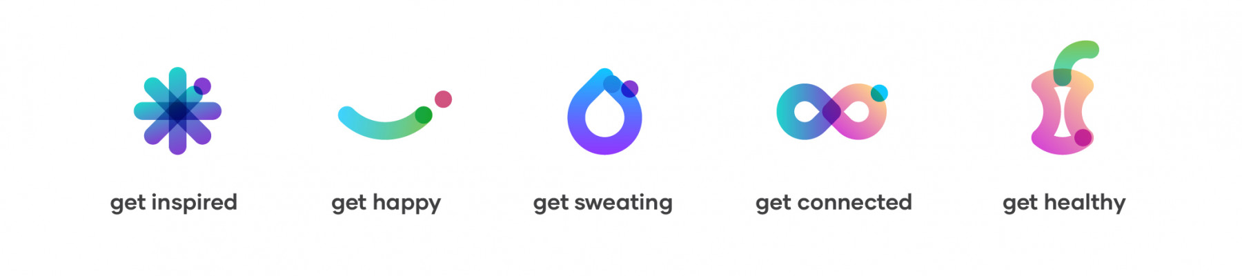
From this insight emerged a powerful strategic framework anchored by four key brand pillars, each designed to drive consistency and clarity across all brand communications. The unifying message was simple yet emotionally charged:
Brand Message: Empowering people to feel good in life.
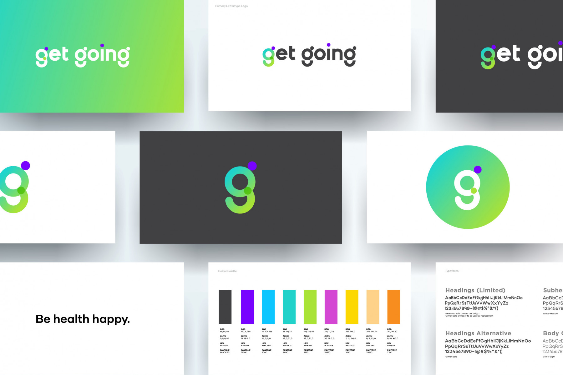
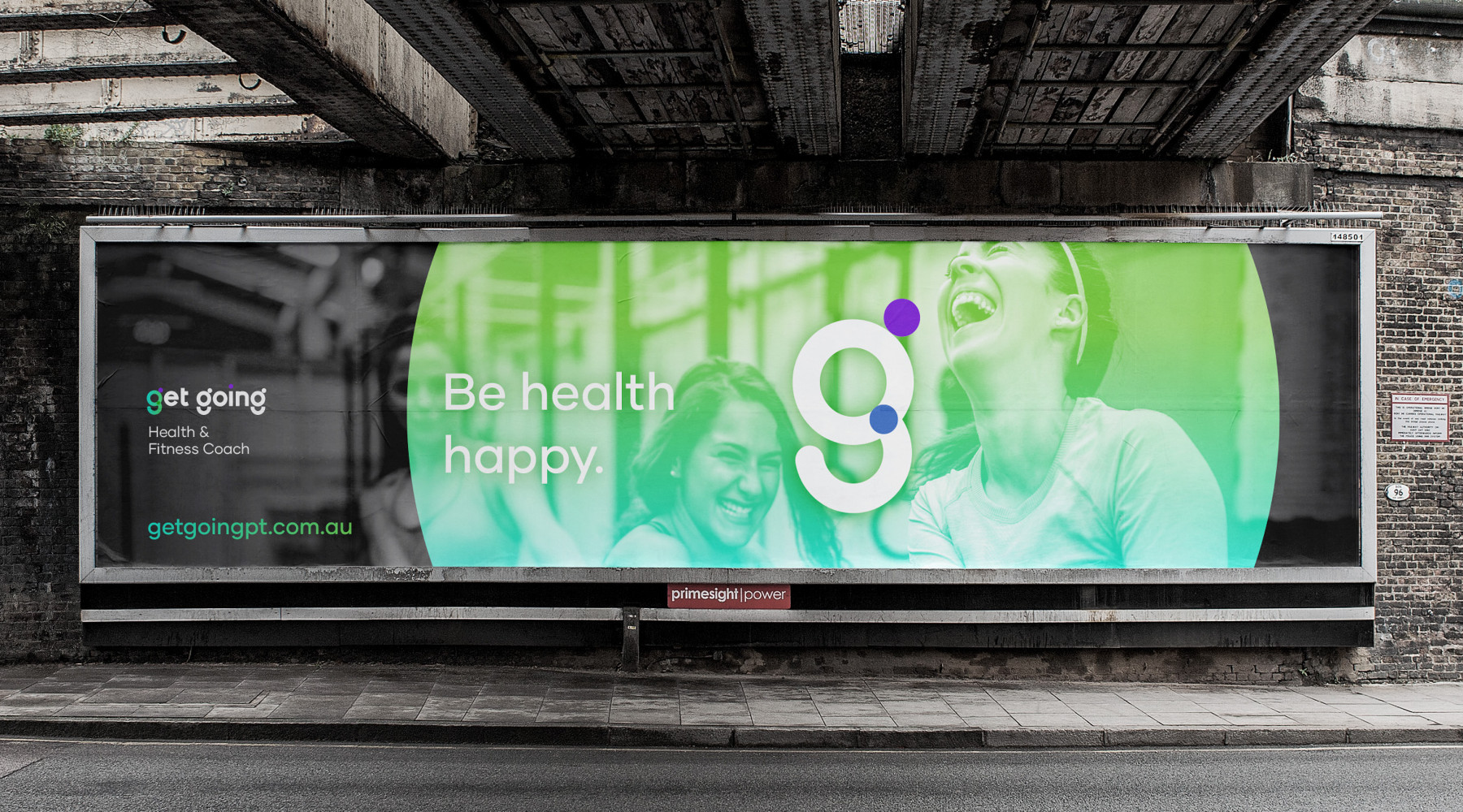
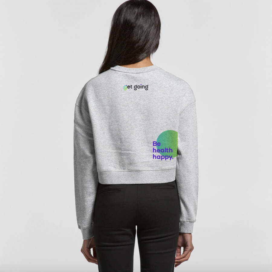
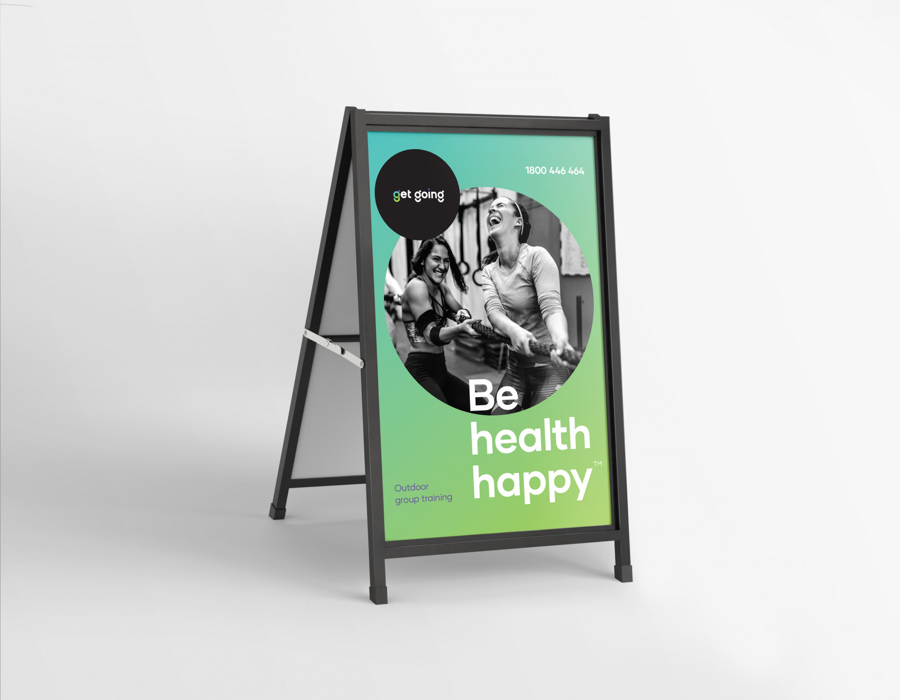
Tagline: Be health happy.
This became more than a slogan — it was a belief system that influenced everything from tone of voice to service delivery. The refreshed branding opened new avenues for growth, introducing certified dietetics, nutrition programs, and mindset coaching to create a truly holistic model of wellness.
The new brand identity and brand positioning reframed GetGoing as a premium, purpose-driven brand that champions happiness and health in equal measure. With a more vibrant, human tone and a clear strategic foundation, GetGoing evolved from a personal training business into a national wellness movement — one that helps Australians feel good in body, mind, and life.

Creative
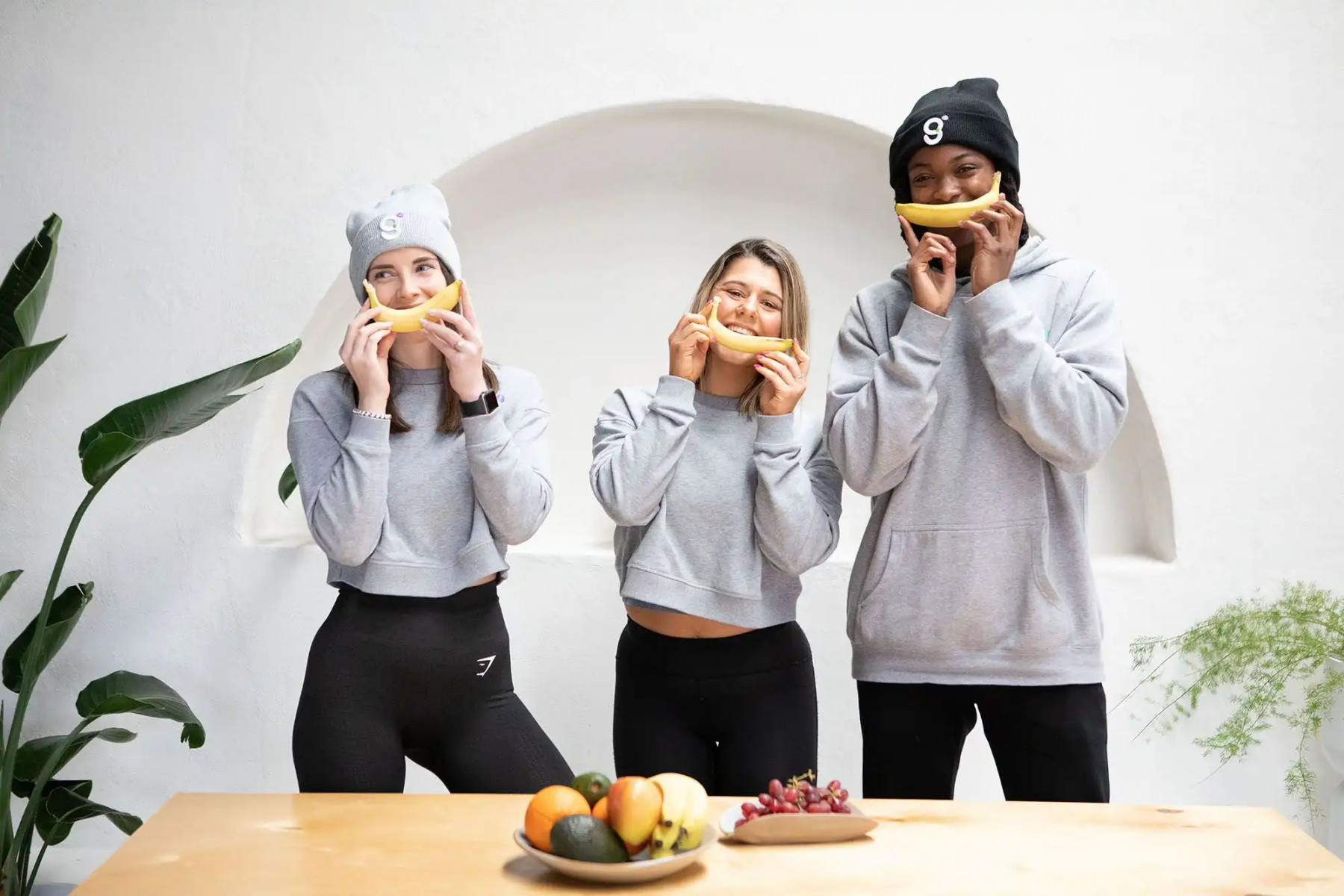
The evolution of the GetGoing brand identity was nothing short of transformative — a complete reimagining of how the brand looked, felt, and communicated. With the brand positioning and key messaging pivoting toward positivity, confidence, and holistic wellbeing, the new identity needed to reflect a more inclusive, energetic, and future-ready brand. It had to communicate to a wider audience — one that was gender-neutral, culturally diverse, and inspired by optimism.
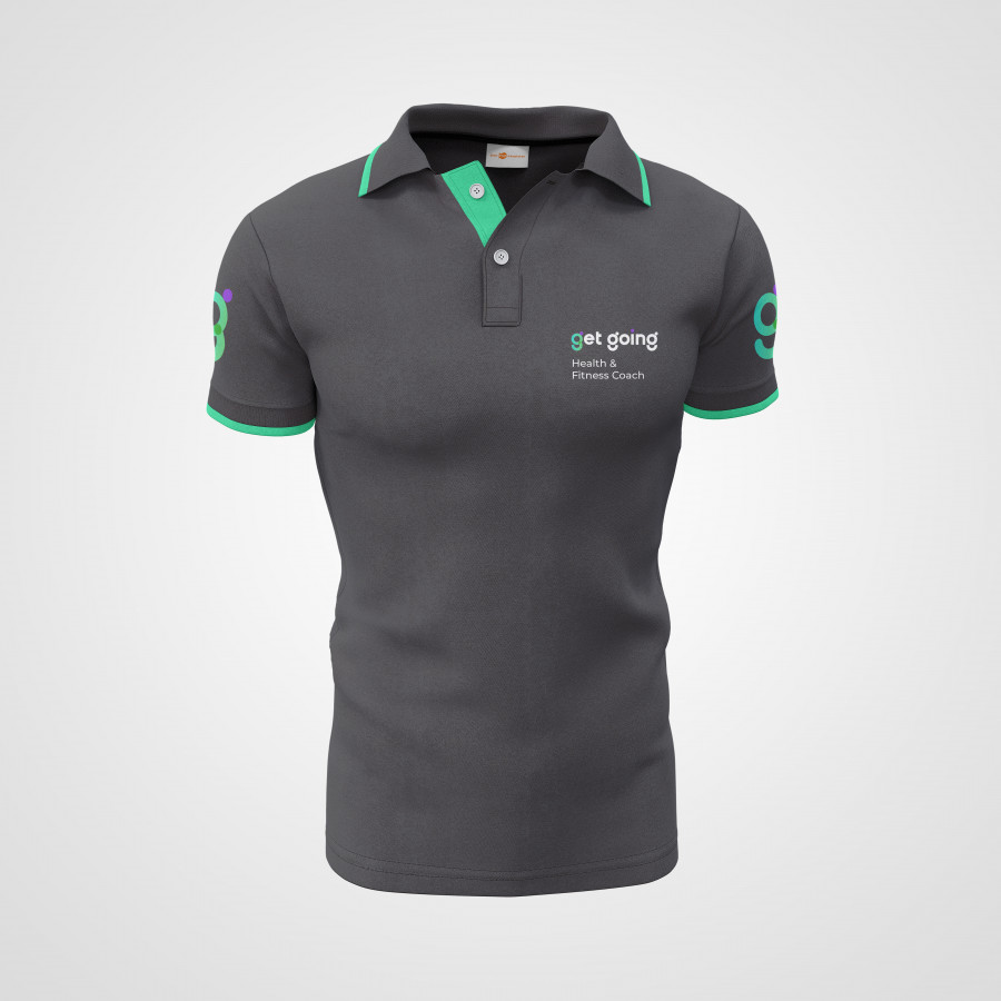
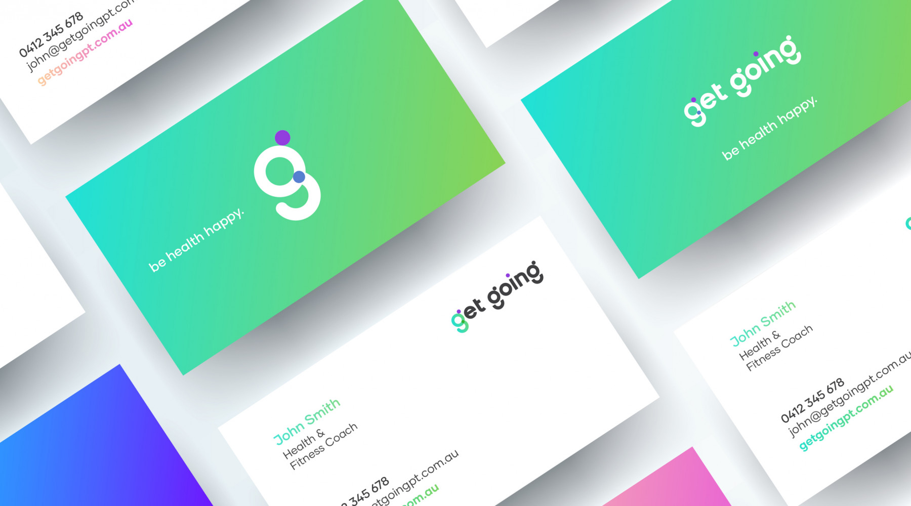
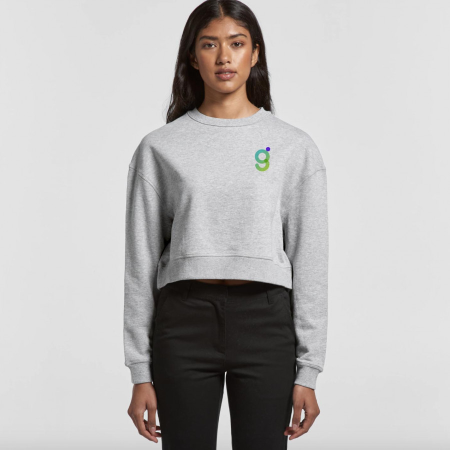
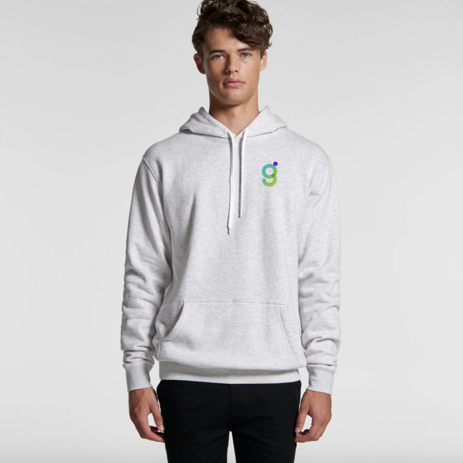
At the heart of the branding lies the new ‘g’ mark — a powerful shorthand symbol that embodies the essence of GetGoing. Within it, a subtle smile represents happiness, health, and trust — a signal that clients are in good hands. More than just a logo design, it became a symbol of energy, movement, and progress — continuously adapting to new environments as the business grows. It needed to feel uplifting yet grounded, evoking both emotional connection and conviction — because good health, after all, is worth celebrating.
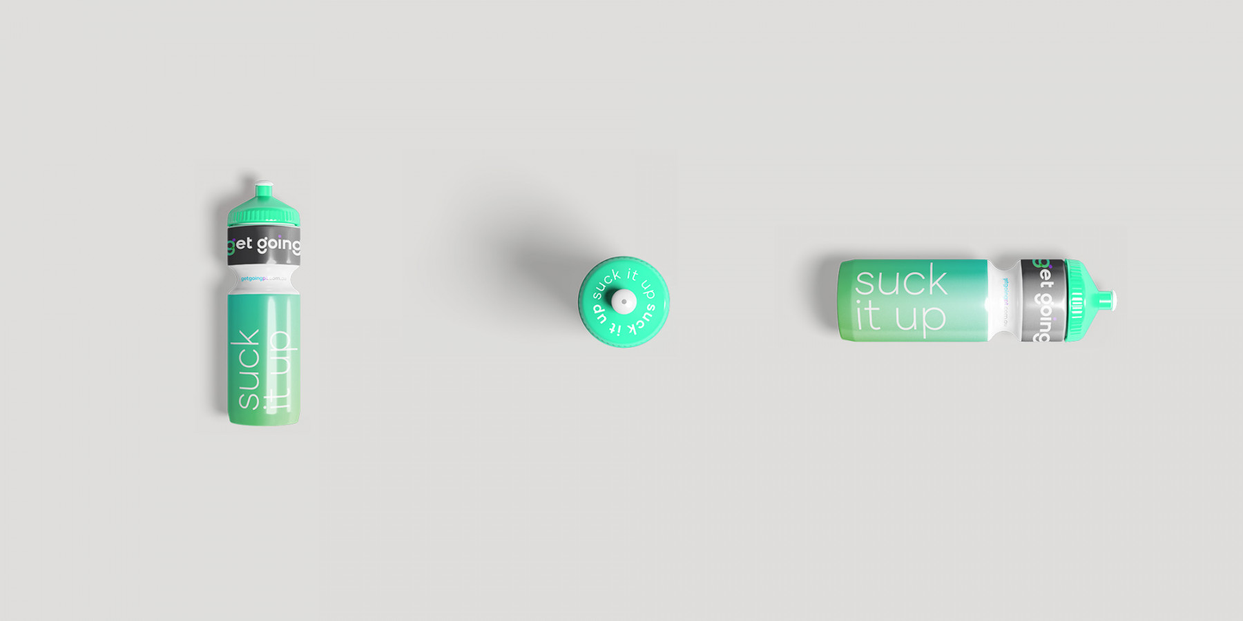
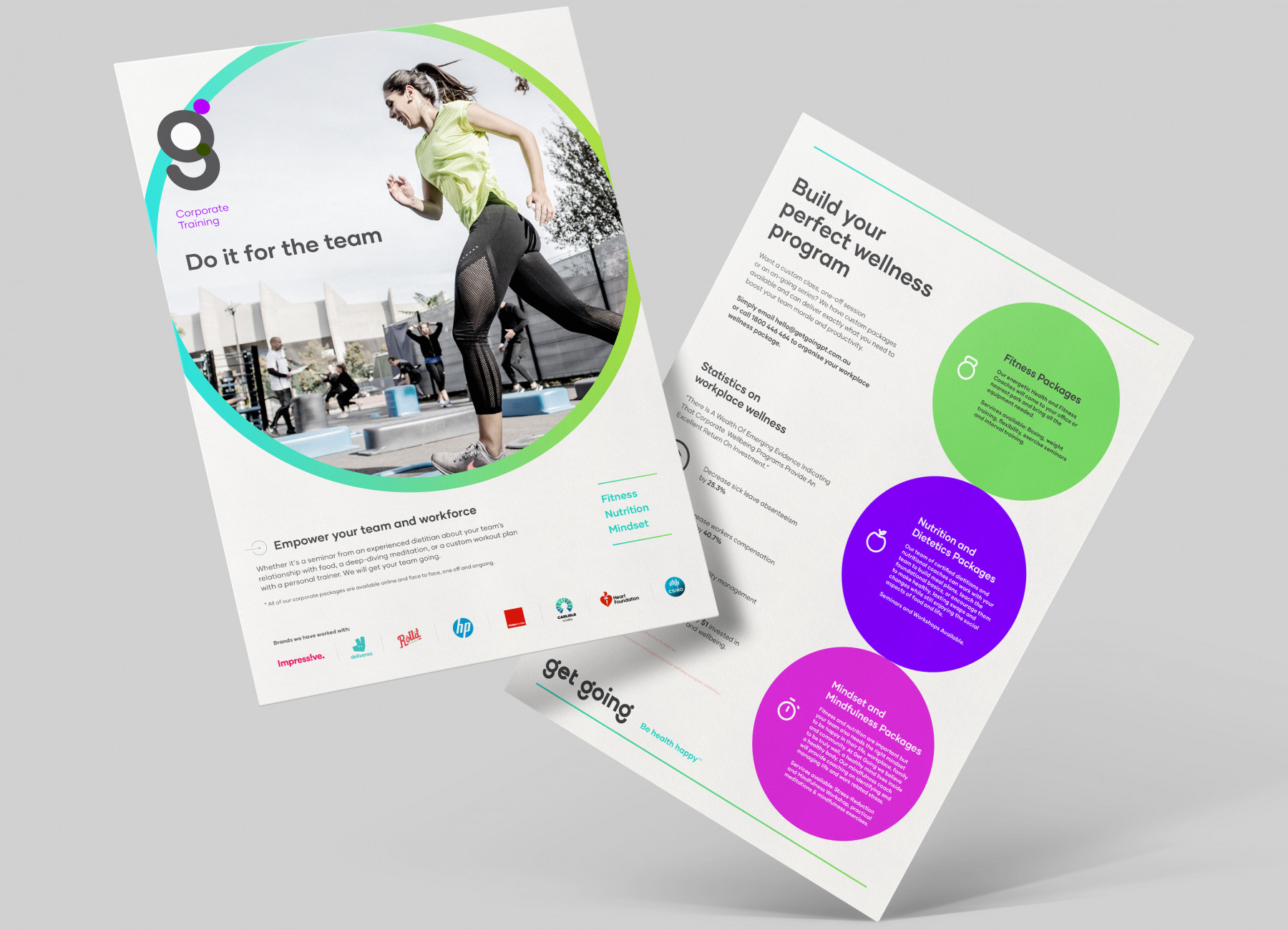
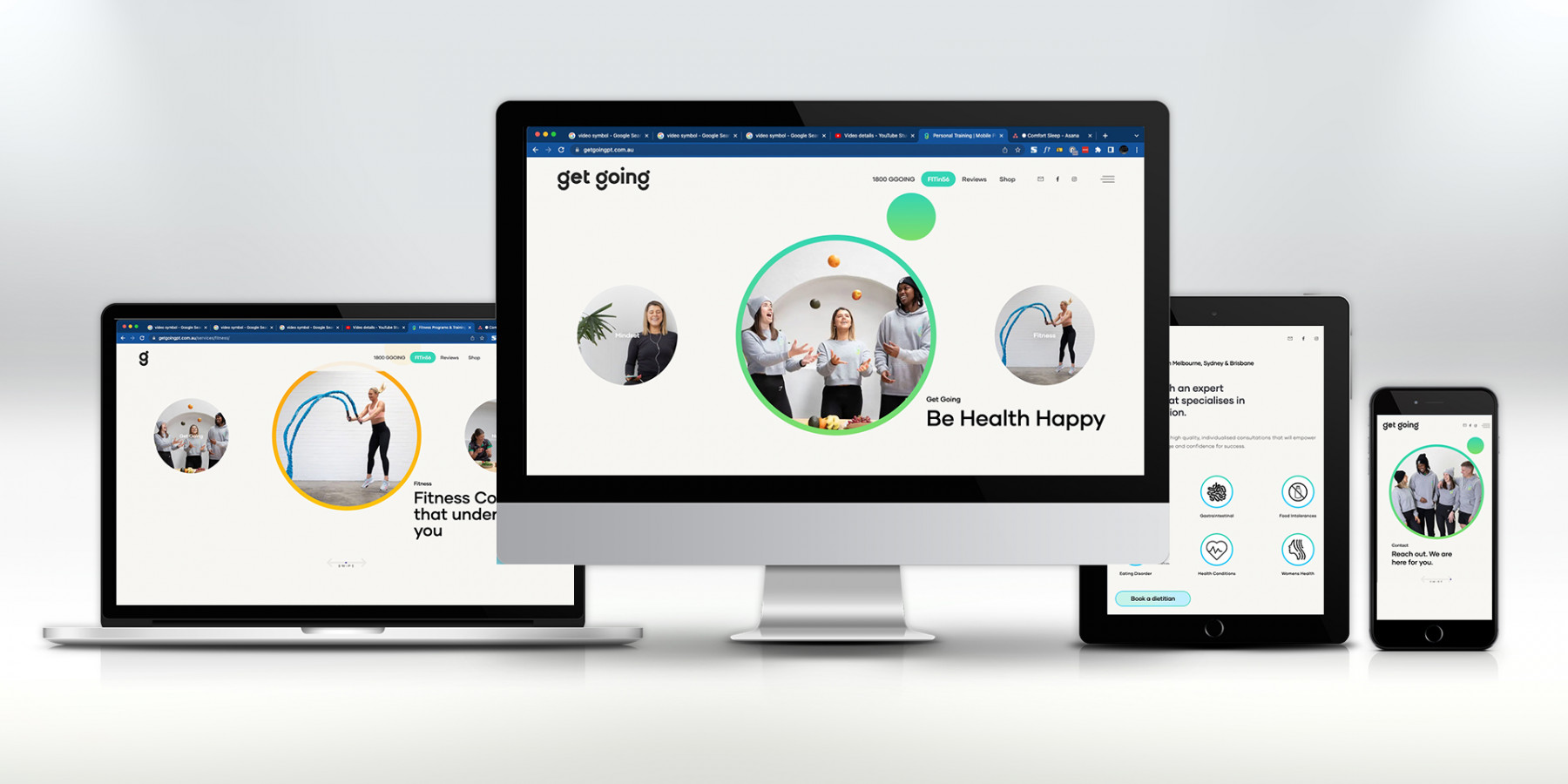
The new visual identity is vibrant, expressive, and versatile. We developed a dynamic colour palette that’s youthful yet sophisticated — bursting with energy but carefully balanced to remain professional and credible. The brand languagemirrors this duality, combining playful confidence with warmth and authenticity. Together, they create an approachable yet aspirational tone that truly embodies GetGoing’s mission to empower people to feel good in life.
Every design decision reinforced this philosophy. We created a bespoke imagery style focused on movement, diversity, and real emotion — celebrating genuine moments of achievement and human connection. Custom typography was introduced to reflect friendliness and openness, while a flexible system of colourways allowed the brand to adapt seamlessly across environments and platforms.
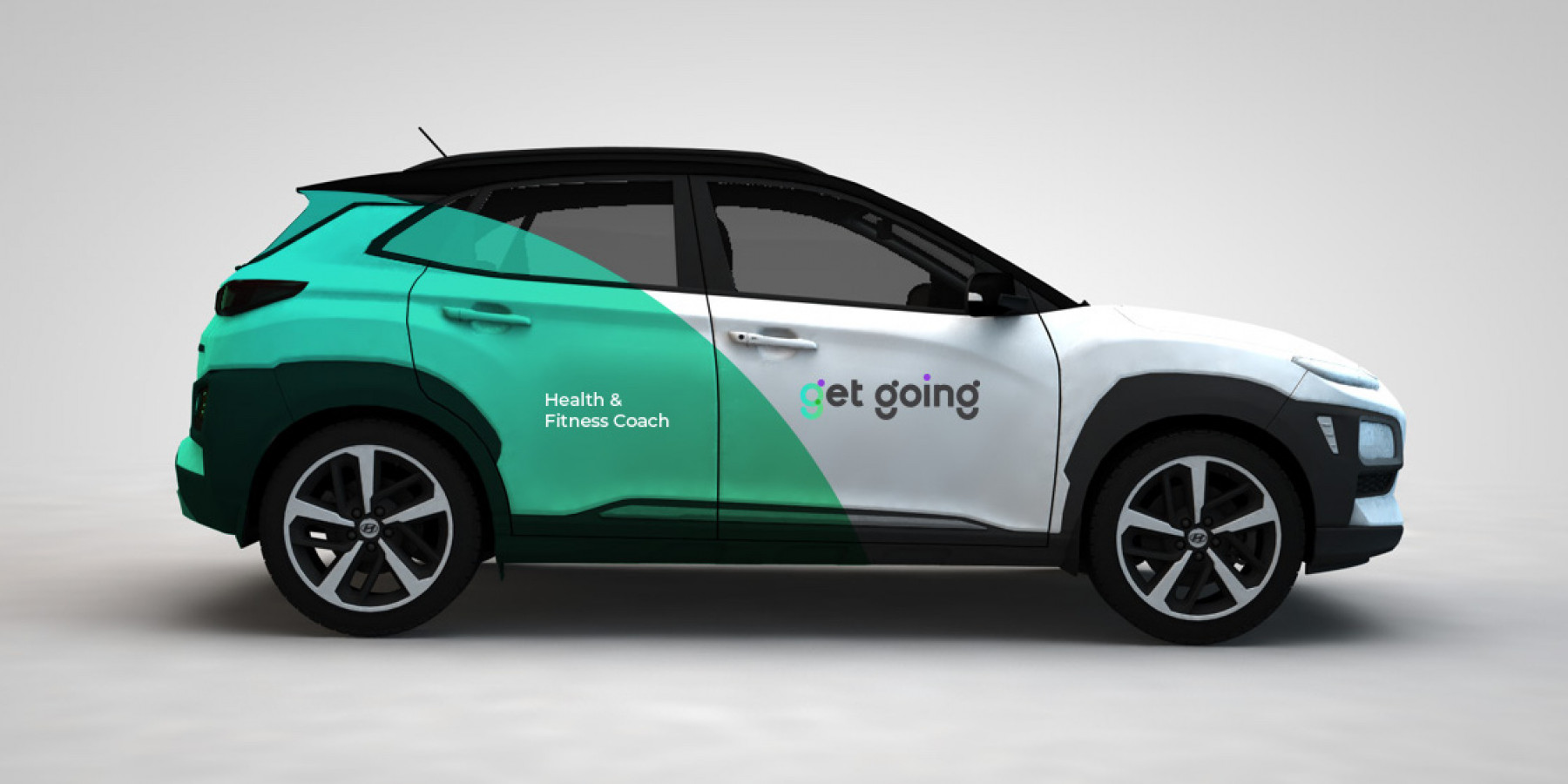
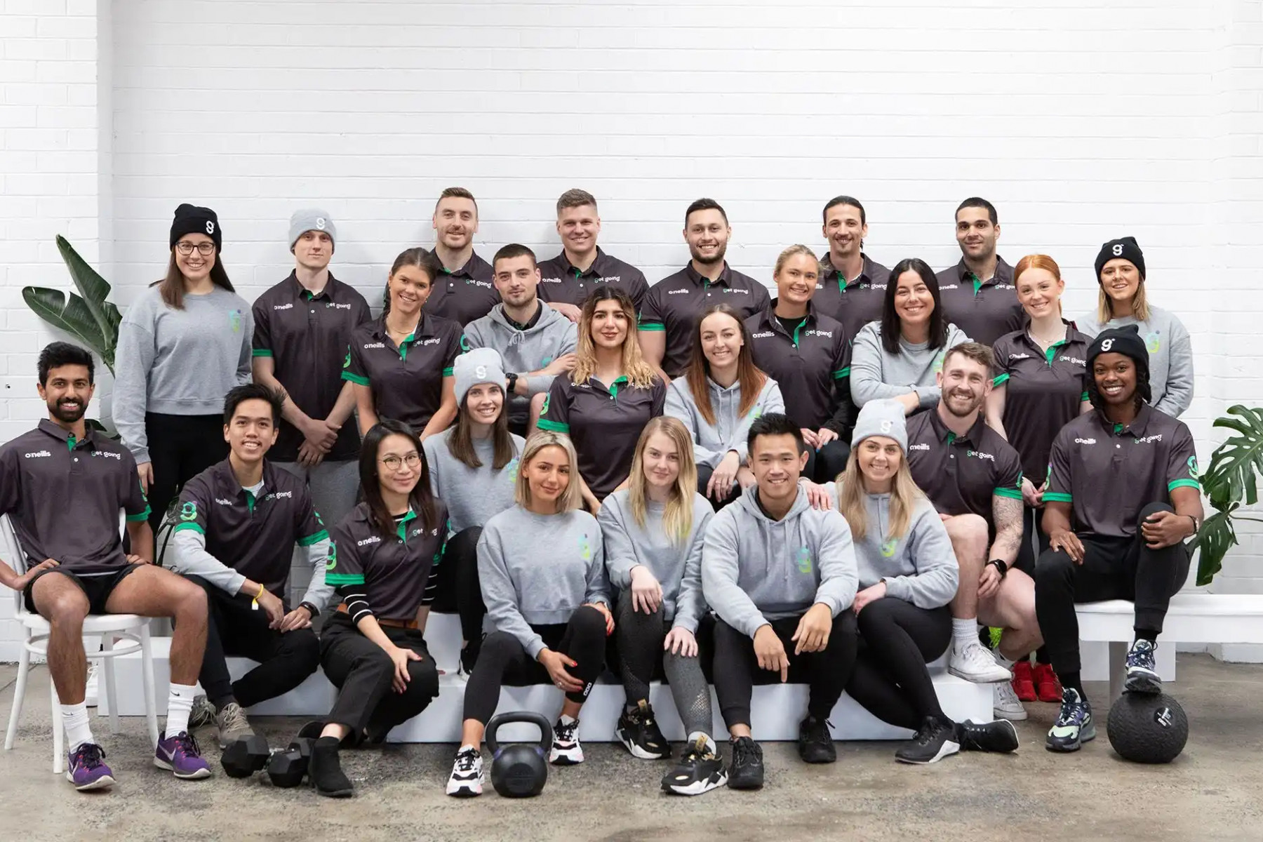
From print to digital, the new brand communications framework rolled out across every touchpoint — stationery, signage, uniforms, brochures, digital advertising, EDMs, the website, e-commerce, social content, and motion design. The result was a bold, unified, and instantly recognisable brand presence that redefined GetGoing’s place in the health and fitness space.
The new identity didn’t just turn heads — it inspired a movement. The ‘g’ became more than a logo; it became a symbol of positivity sweeping through the fitness community. The energy was contagious. People weren’t just training — they were living the message: Be health happy.
Explore more work