Beraldo Coffee
Client Beraldo Coffee
Beraldo Coffee has been part of Australia’s coffee story for over 30 years. As one of the pioneering brands that helped shape Melbourne’s café culture — alongside names like Lavazza and Vittoria — Beraldo set the standard for quality, consistency, and authentic Italian roasting tradition. Over three decades on, the brand continues to thrive across both commercial and domestic markets, with its signature blends enjoyed by a new generation of coffee lovers nationwide.
But the coffee landscape has changed. In today’s culture, coffee is more than a beverage — it’s a lifestyle, a ritual, and a daily expression of taste and identity. With competition from boutique and specialty roasters at an all-time high, Beraldo needed to evolve. The brand needed to sharpen its brand positioning, elevate its brand identity, and communicate its story with clarity and pride.
Our brand strategy focused on reconnecting Beraldo to its roots while projecting a more contemporary presence. The mission was to celebrate its heritage — a family-owned business built on craftsmanship, passion, and authenticity — while crafting a modern visual and verbal language that could compete confidently in a design-led market.
Through a revitalised branding system, refined brand communications, and new creative direction, Beraldo now stands as a bridge between legacy and modernity — a coffee brand with genuine heritage, but a fresh, confident voice for today’s consumers.
The result is a brand that not only looks the part but feels the part — proudly telling its story, reclaiming its authority, and reigniting its position as one of Australia’s most enduring names in coffee culture.
Brand Strategy
Our approach to developing the Beraldo Brand Strategy with their team was inclusive; and rewarding. We learnt a lot about their people, the specialist skills and knowledge each of them have as well as their extensive process to roasting coffee. Such a complex, yet well refined process made us carefully think about how important it was to build a brand strategy that was uniquely them. A strategy that would define who they were and where they wanted to go.
Through multiple workshops with their team, we delved deep into the heart and soul of the brand asking many questions and challenging views and ideas. Being a dual facing brand (B2B and consumer facing), we needed to ensure the brand framework and messaging we delivered would work for both segments, was rooted in reality and was not too much of a stretch for the brand.
We settled on the key brand message of ‘More than just great coffee’, which was then further distilled down into the tagline of ‘There’s more to enjoy’. This message was fully loaded with benefits. From a B2B perspective, it communicated the Beraldo families’ love, commitment and support for their clients business; suggesting that they would always be there for them ~ from providing exceptional coffee, right through to servicing, maintenance and genuine friendship (Which many others lack surprisingly). What more could a Barista or restaurant owner want.
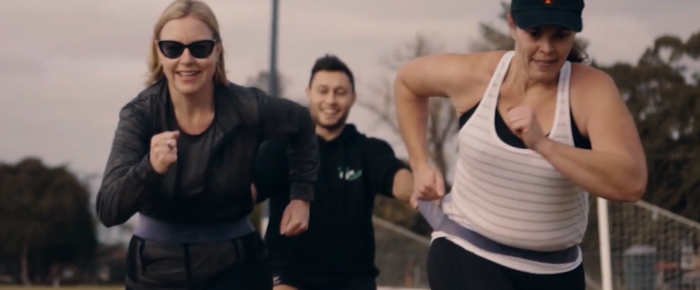
From a consumers viewpoint, their coffee was on-point and tasted the way real coffee should taste. Beraldo’s commitment for sourcing the best coffee bean and roasting it to perfection was not only tasted through their coffee, but experienced through many brand interaction points like on coffee cups, restaurant signage, cutlery, packaging, promotional products and social media. The brand also gave back to local communities through many socially-good and environmentally sustainable programs which meant customers were even more invested, proud to support and ask for their brand at café’s and restaurants. Beraldo simply went further to please.
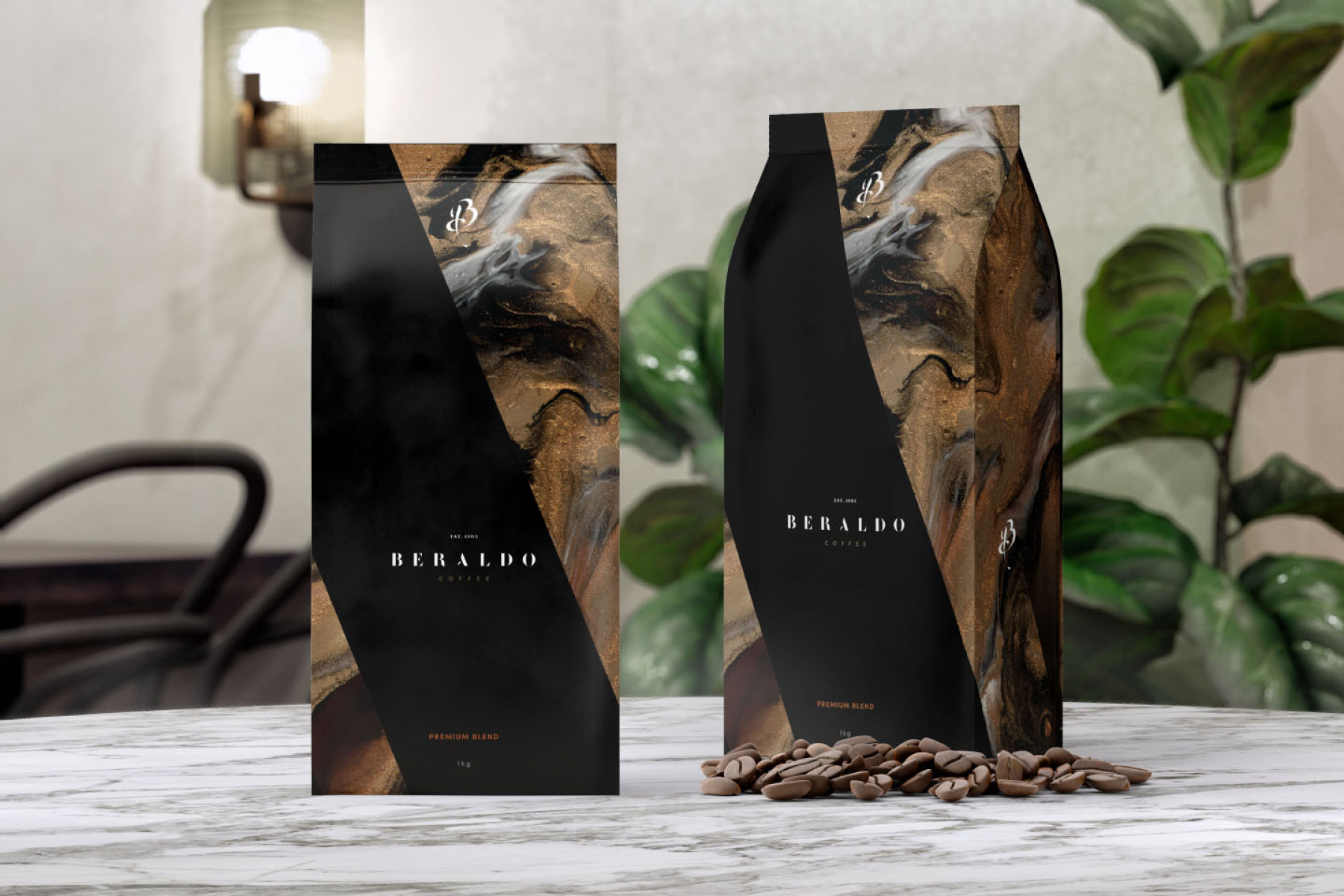
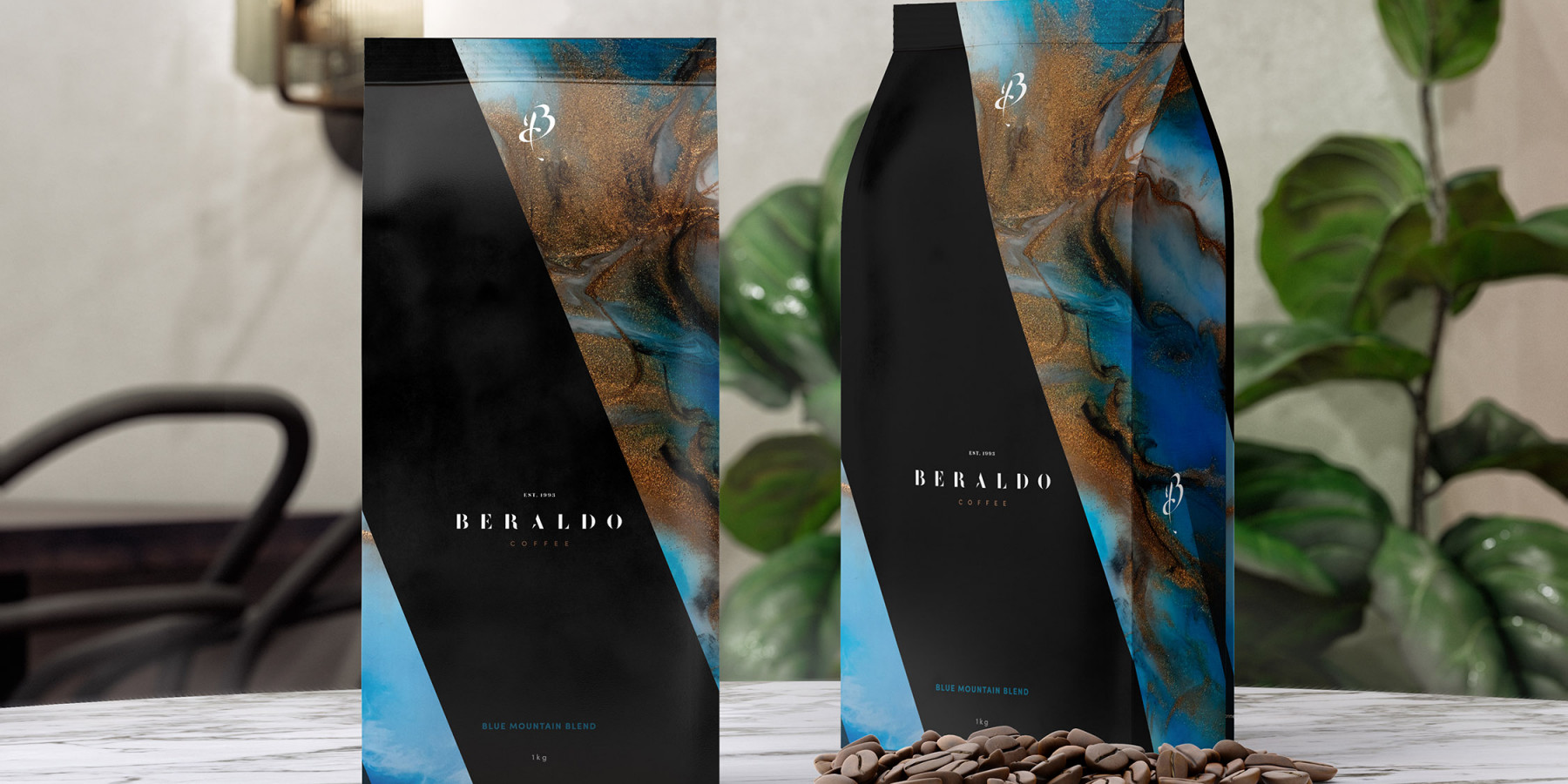
Creative
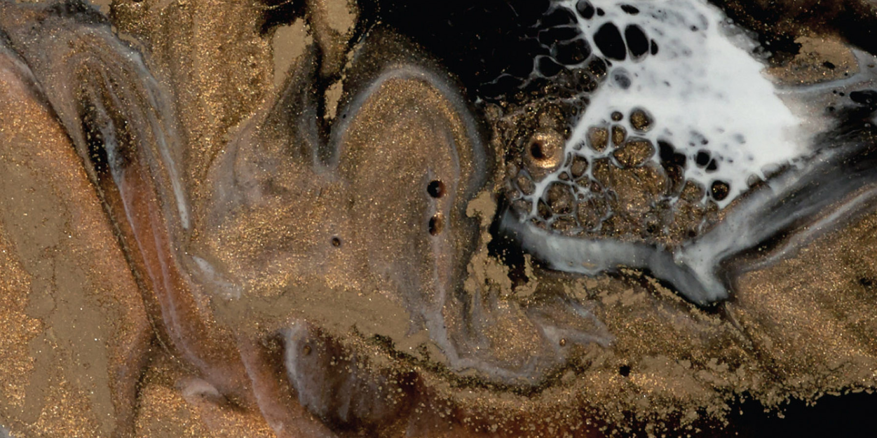
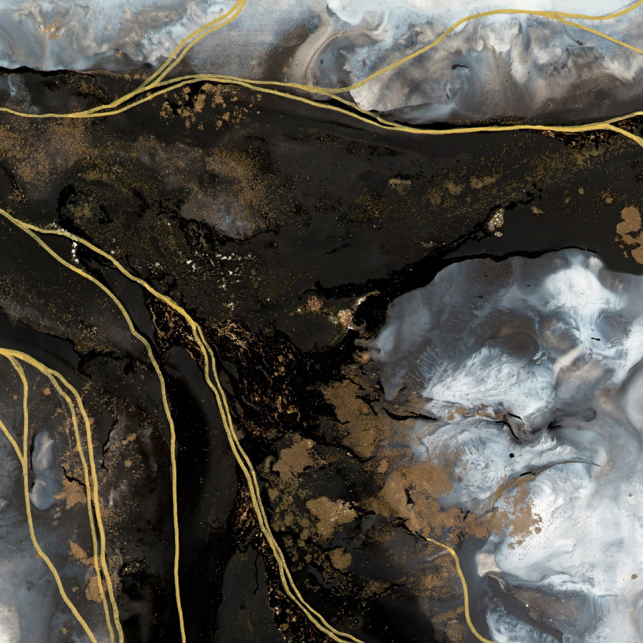
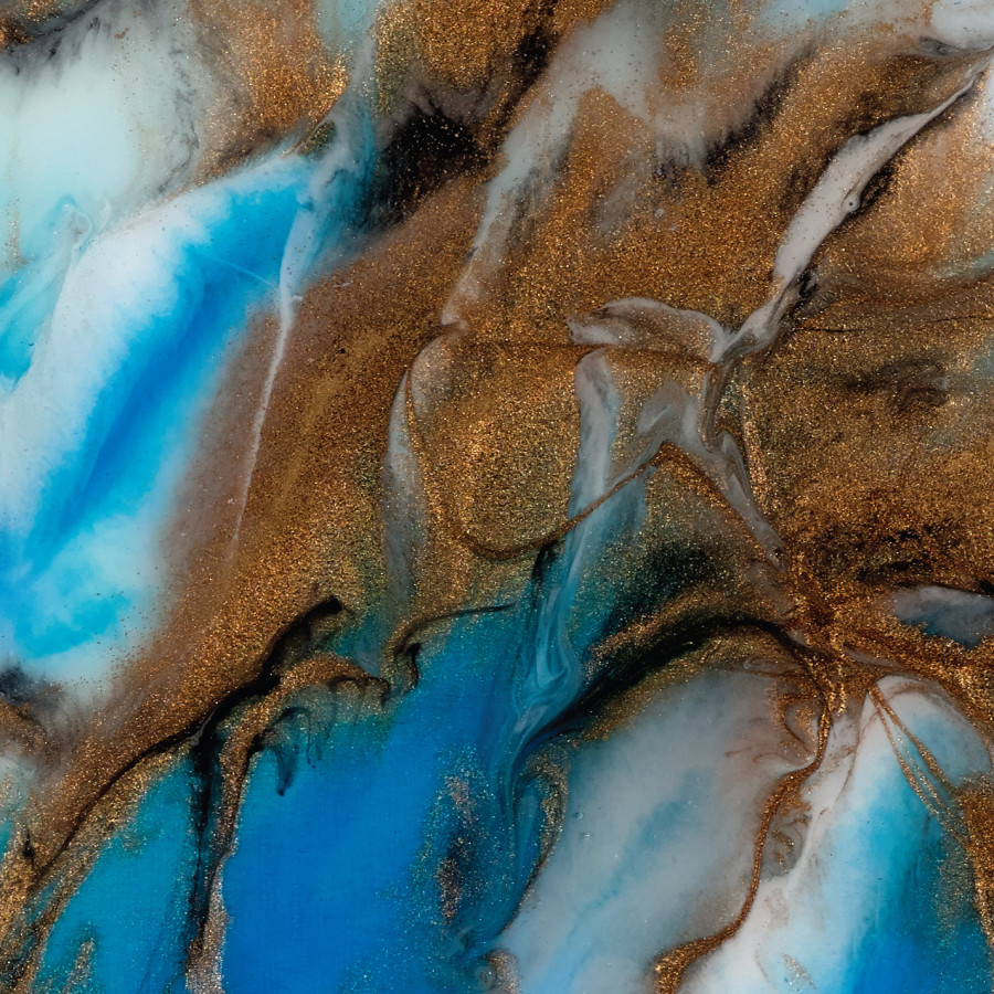
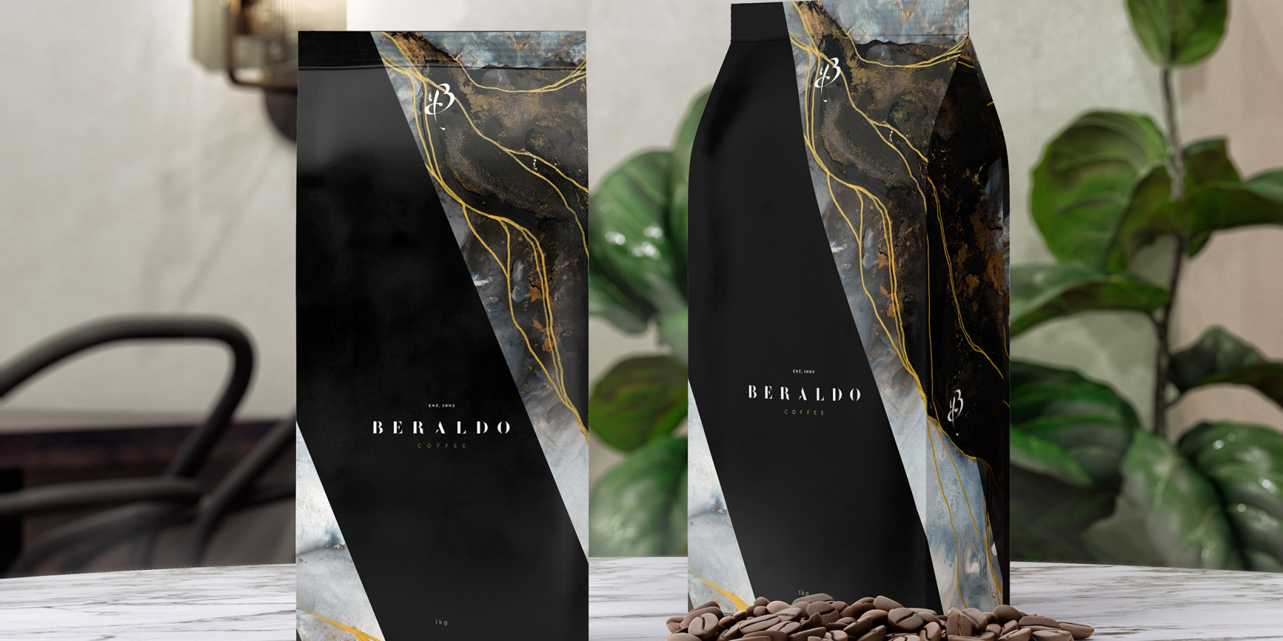
Beraldo wanted their Brand Identity and packaging to look premium and that’s exactly what we delivered. We worked closely with a talented local Australian artist to help us express the Beraldo brand visually and communicate the fine qualities, characteristics and craftsmanship of their coffee making process.
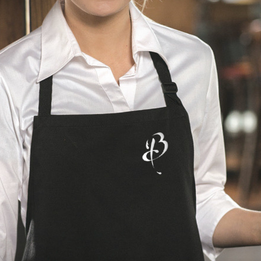
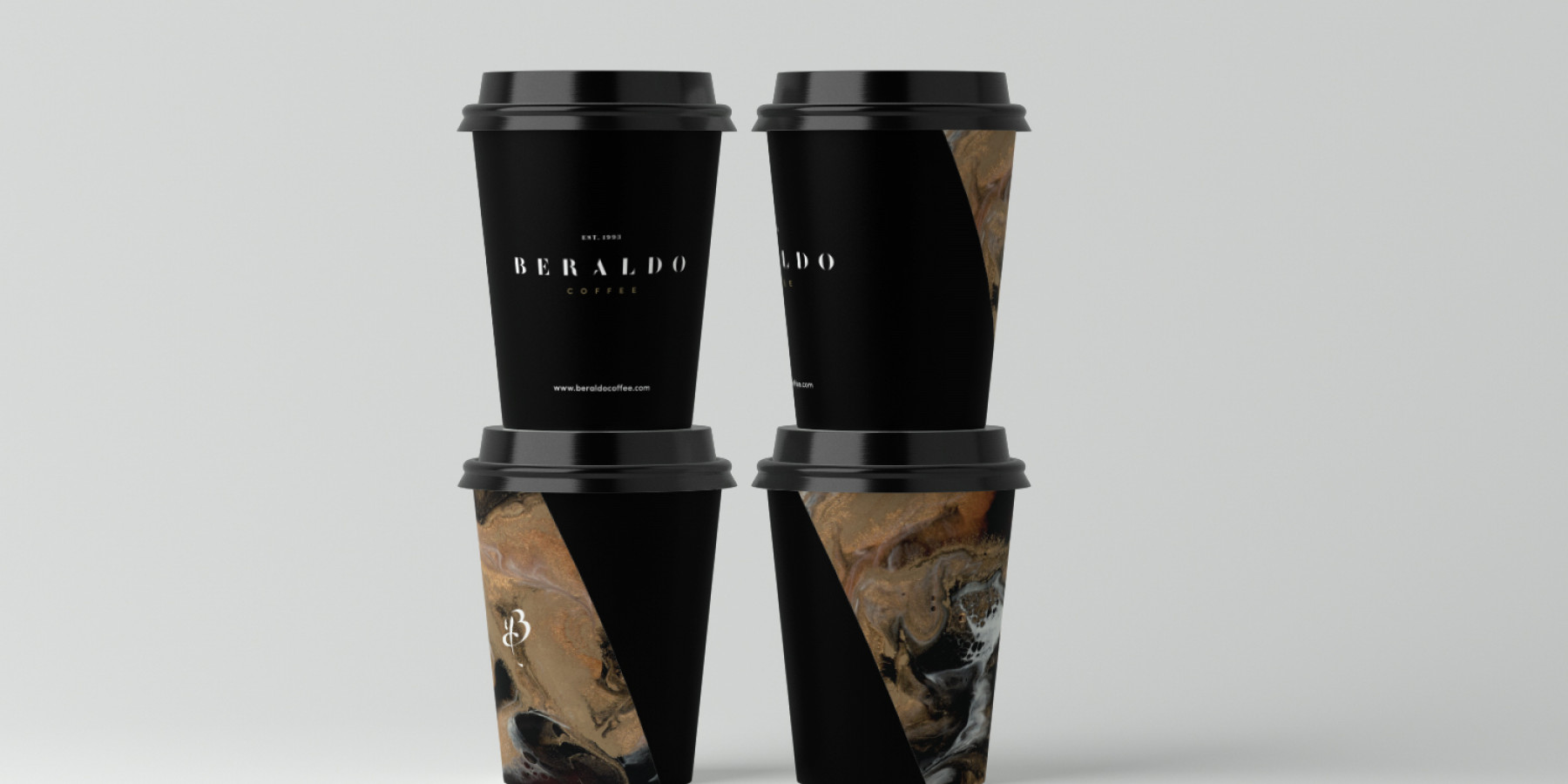
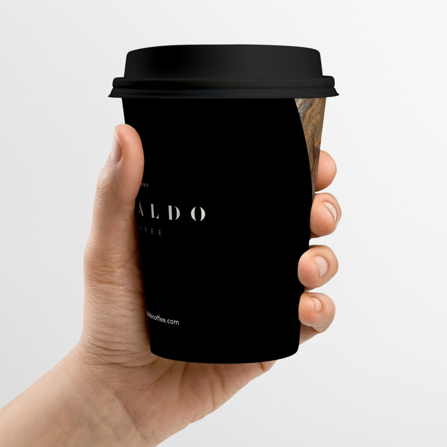
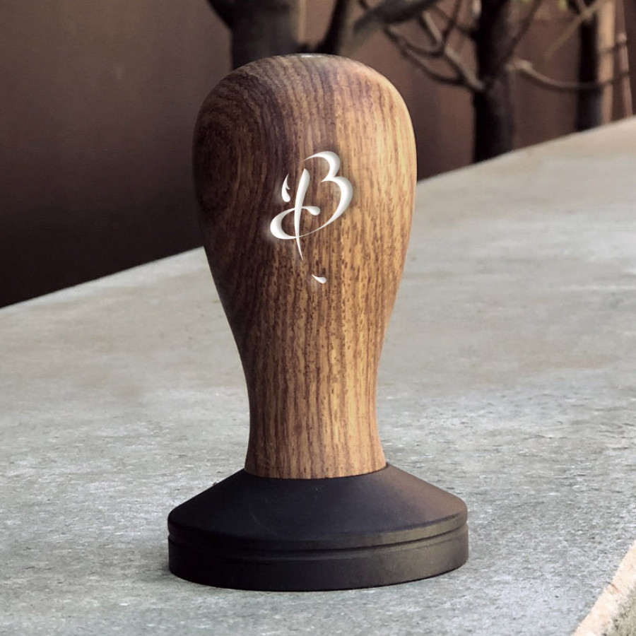
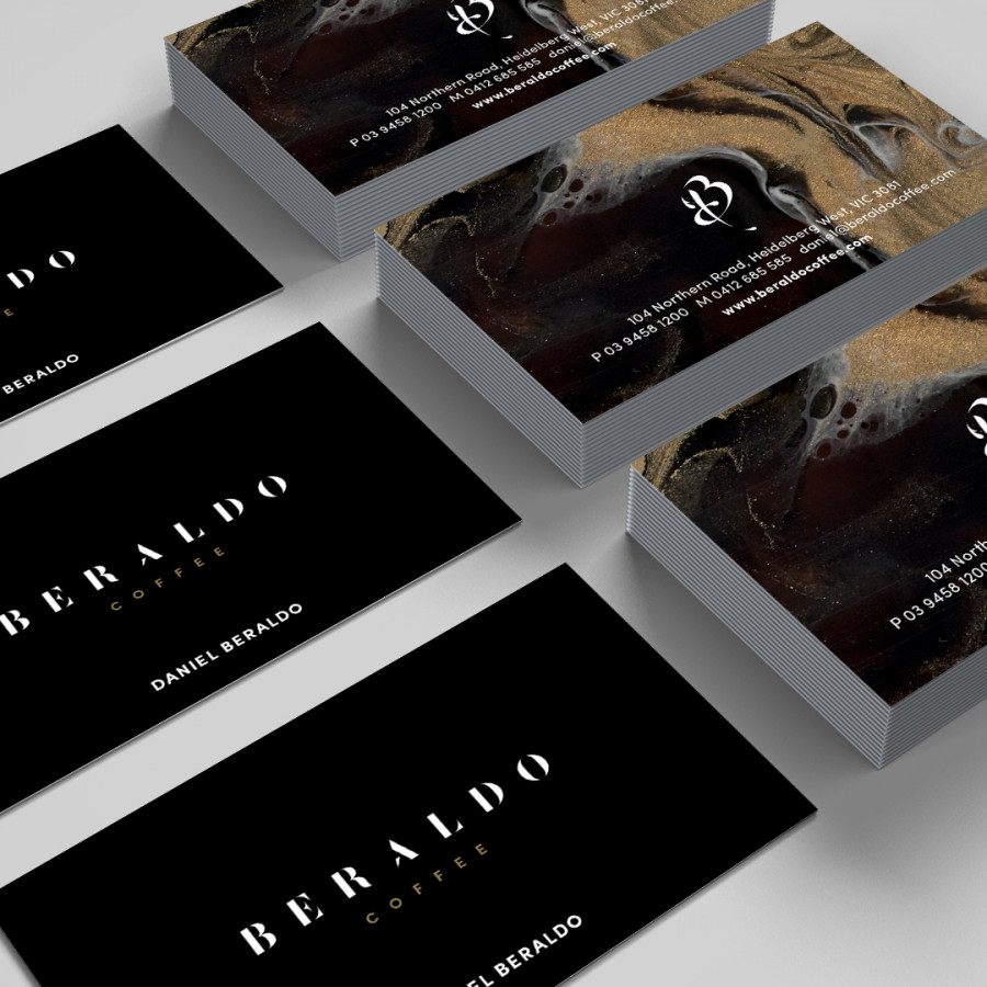
Combined with the artists creative impression, we developed the new Beraldo logomark. This consisted of a new bespoke typeface design as well as crafting a brand symbol that expressed the ‘B’ in Beraldo and also captured the essence of coffee being poured. This symbol was designed to help build brand recognition and become the identifiable statement mark that people would potentially look for when buying their coffee. It was intended to become a symbol of trust and loyalty to the brand.
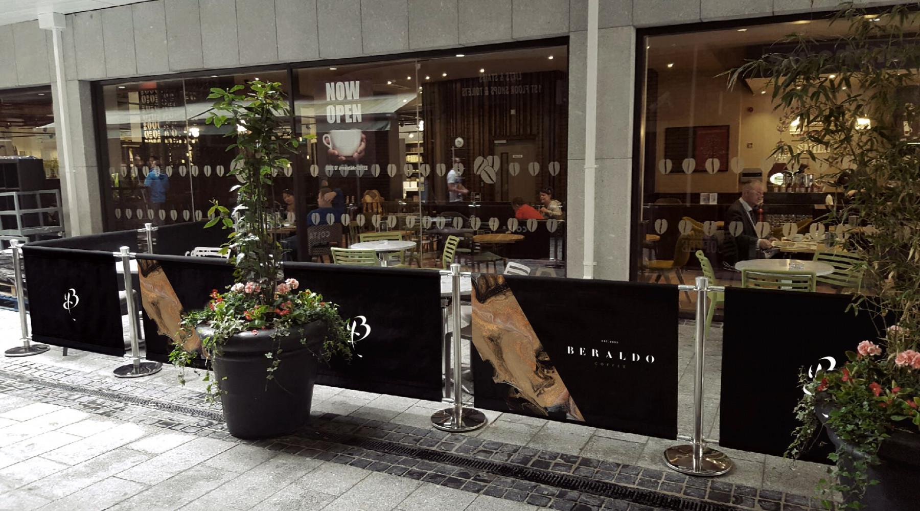
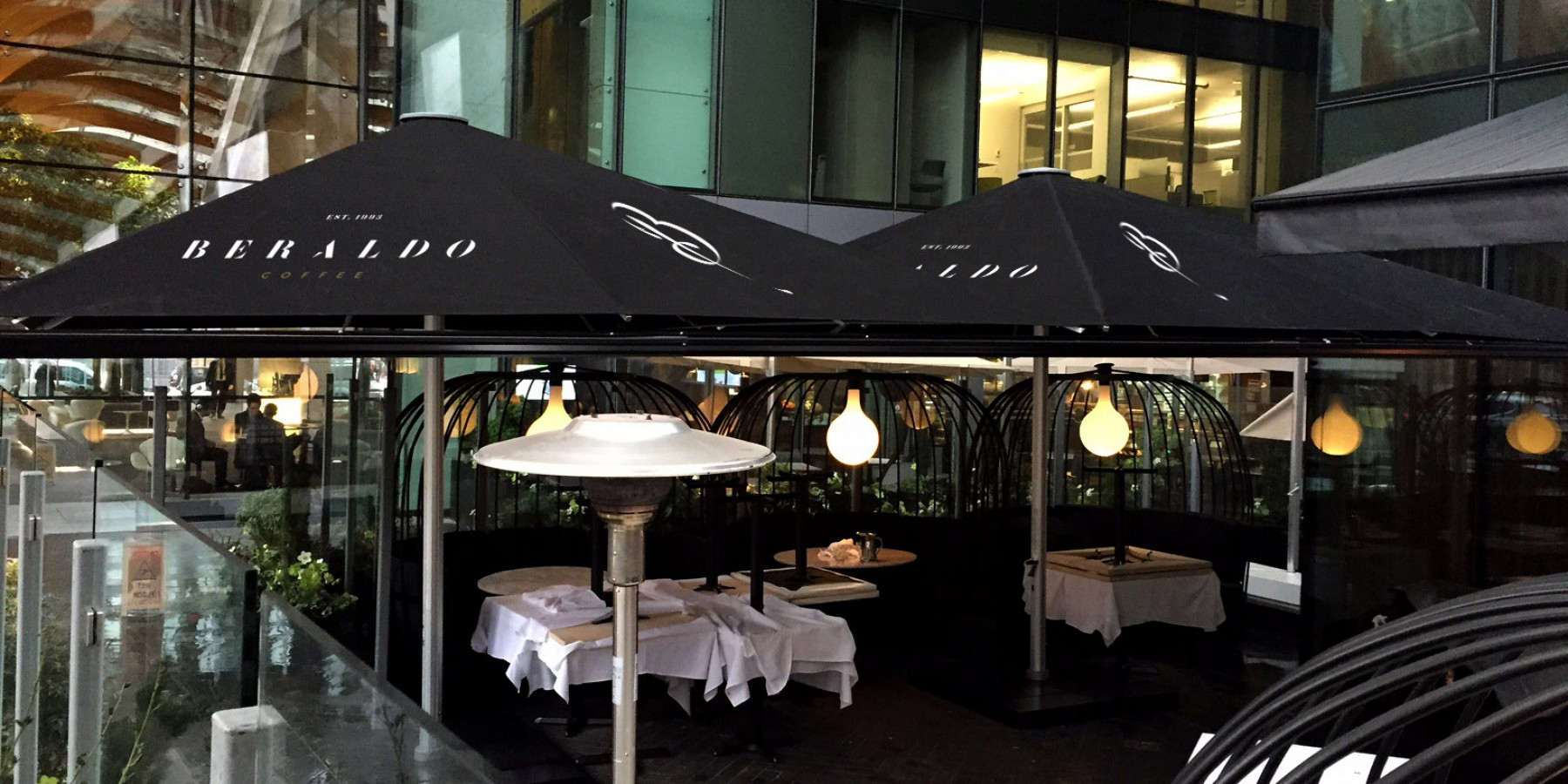
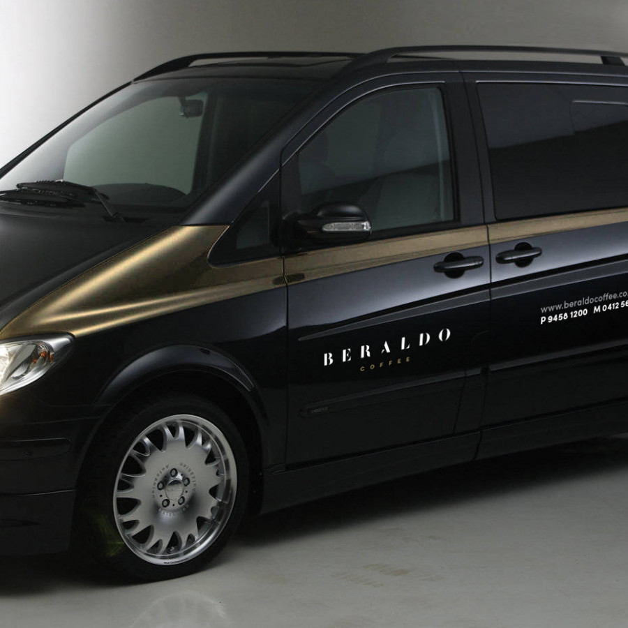
To lift all the creative pieces, we used a special gold metallic ink on the coffee packaging and cups to help elevate the premium nature of their coffee and give it an exclusive look and feel. Brand touchpoints that we worked across included bag packaging, cups, cutlery, umbrella signage, barriers signage, promotional merchandise, car livery, apparel, video content, photography and of course everyday business essentials like stationery and menus.
Today, Beraldo stands tall and proud. They know who they are. They’re all unified and clear on their brand direction. And they all live and breathe the brand consistently every day. Now they are embarking on new territories where the old brand just couldn’t venture.
Explore more work