GetGoing
Client GetGoing
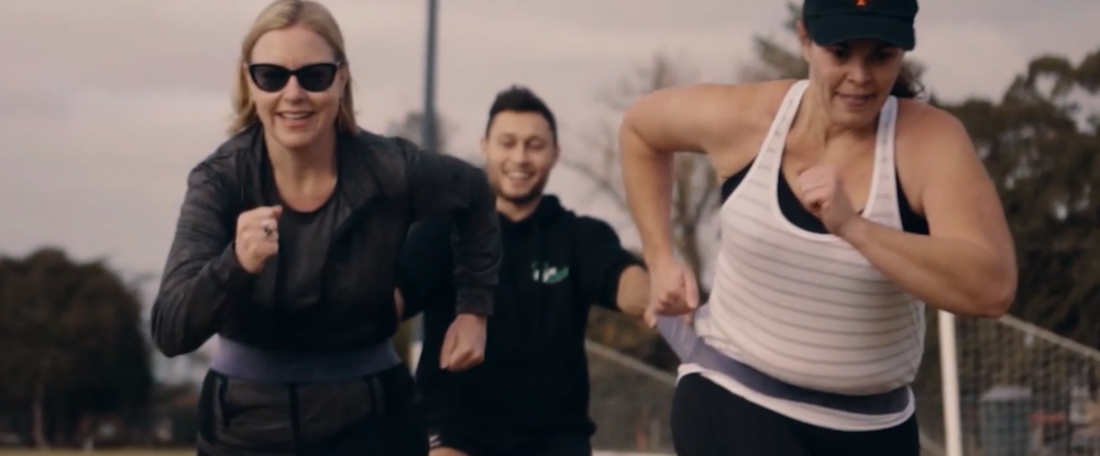
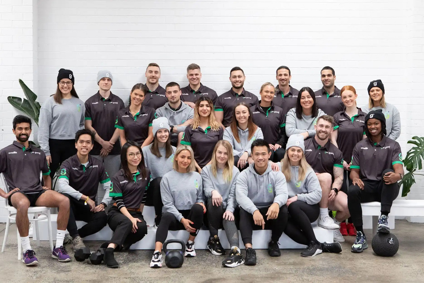
GetGoing is Australia’s top tier mobile health and fitness provider. The founders originally built the business offering mobile personal training as their core service; but through this ‘brand exploration’, they further added dietetics/nutrition guidance and mindset management to their armour. They were, and even still now, leaders in their industry and have operations nationally with over 200+ coaches specialising in fitness and nutrition ~ delivering tailored and specialised programs that are making a difference to their clients' health and wellbeing.
The business was at a pivotal point where it needed to focus on their next avenue of growth; so assessing the current strength and perception of their ‘brand’ was our starting point. We needed to learn more about their customers, the value GetGoing provided as well as better understand the landscape and space in which they operated it. It was clear from the very beginning that from a creative perspective we needed to inject more life and vibrancy into the brand and position them as premium health and fitness providers ~ focusing on improving overall quality of life. A brand that offers value for money and proven results.
We began our brand journey with GetGoing starting at the very roots of the business – diving deep with the directors/founders and of course with their valued clients. After a series of strategic workshops mapping out competition, the business landscape, their positioning and challenging thoughts and ideas about their brand, we learnt that their potential was truly untapped. The tap needed to be turned on ~ full blast. There was so much scope for growth and exploring other avenues in the health and wellness space would drive their differentiation and put them in a league of their own. It was game on.
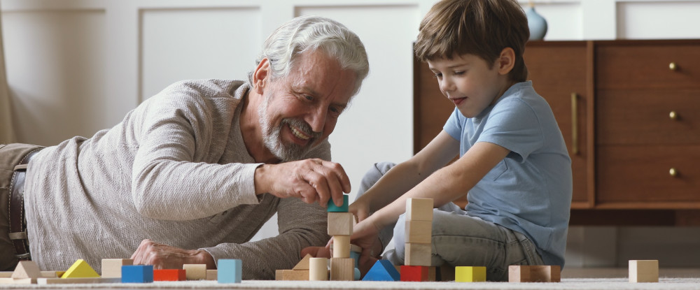
The key driver we needed to address and elevate was the idea/perception of ‘premiumness’ ~ ultimately the value they provided to their clients. What they offered when compared to their competitors was honest, authentic and grounded one-on-one coaching. This ‘premiumness’ was very rarely seen in the fitness industry as it’s usually driven by high egos and pretention. After conducting multiple in-person interviews with current clients, it was clear that their service was top notch, unrivalled in the PT and fitness space. The big themes that were unearthed were that clients commonly viewed their coaches as best friends, mentors and in many cases a counsellor willing to listening to their life stories. Someone that they could call anytime and just have a chat. So it was clear that they added far more value than just a PT. They were a long life partner in their clients health journey. So this had to be clearly communicated. And it was this sentiment that sparked our thinking, positioning and key brand message.
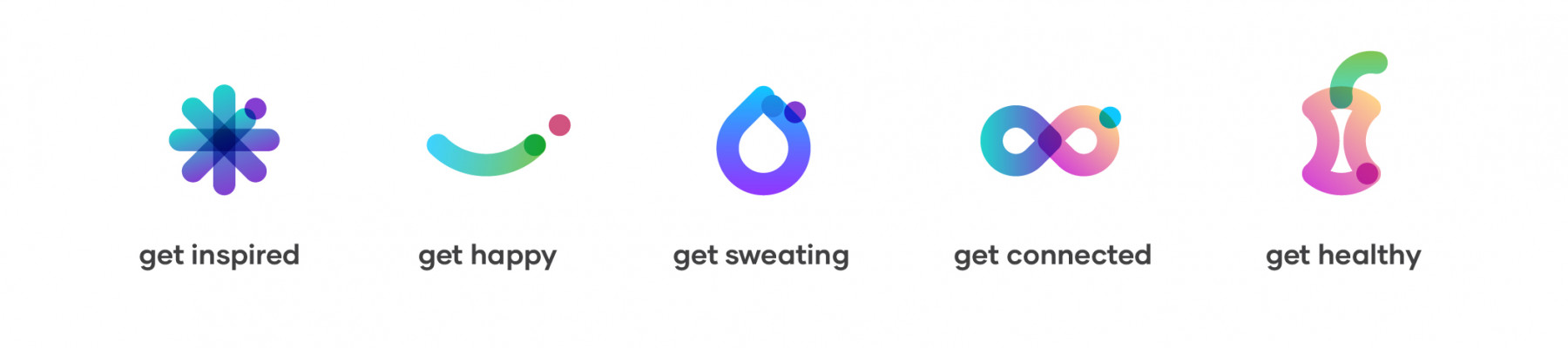
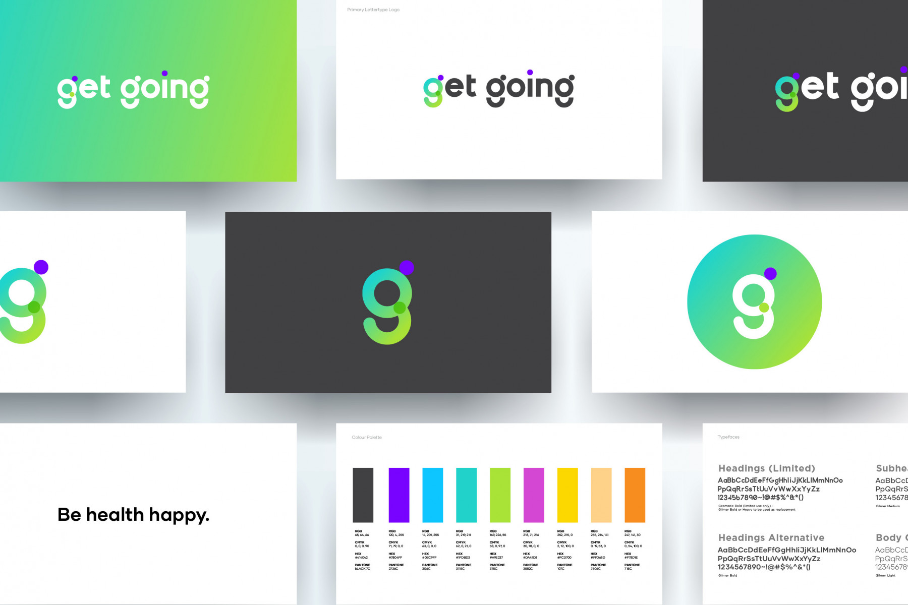
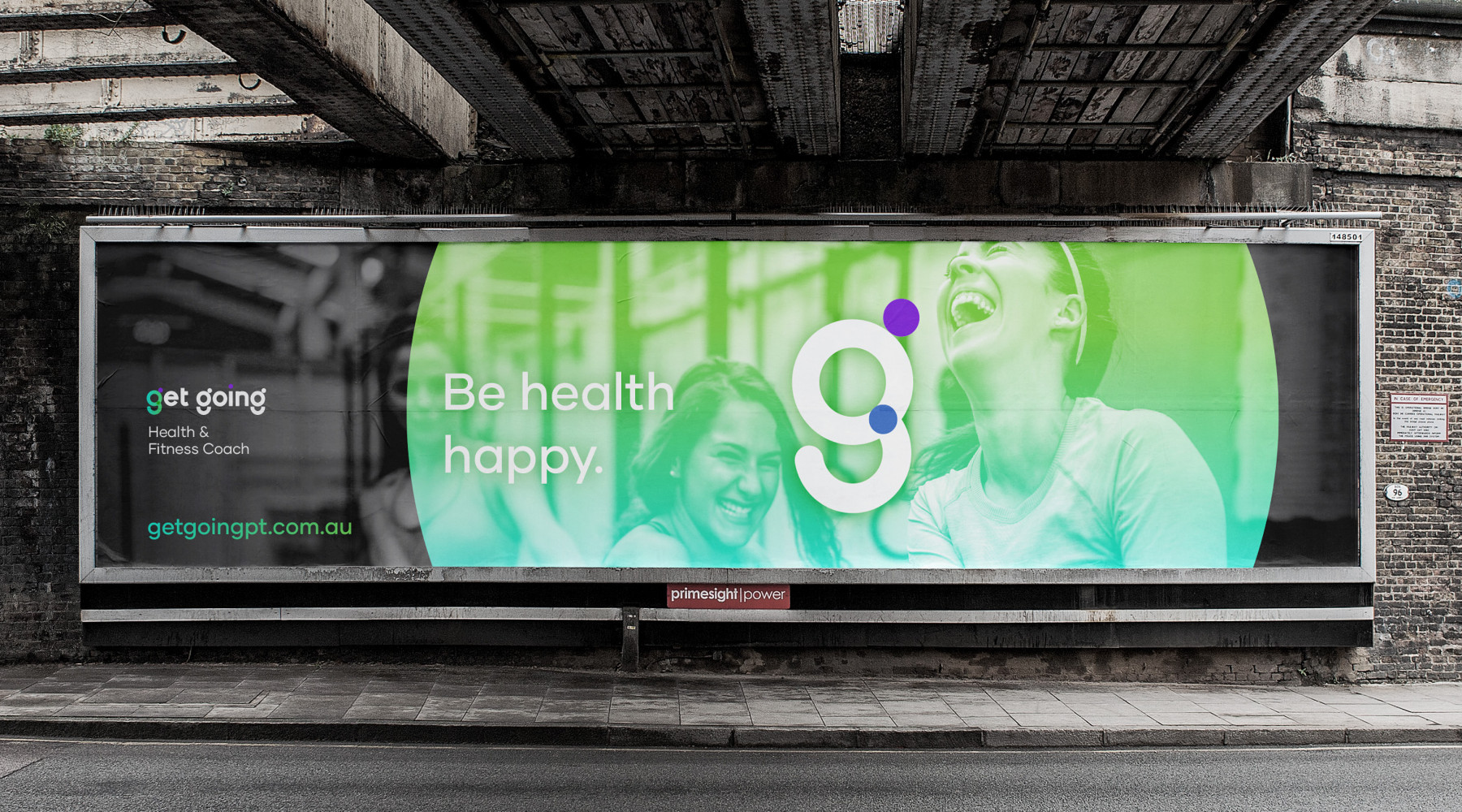
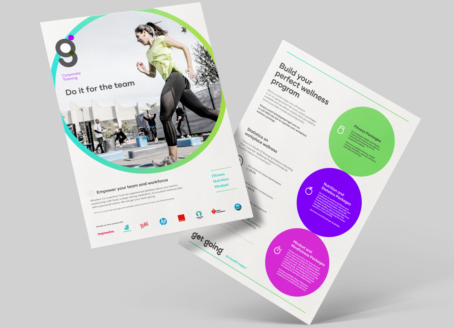
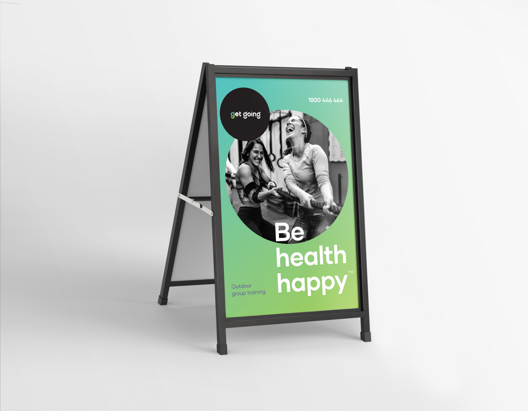
After multiple iterations, we developed and landed on a brand framework that included four key pillars that underpinned and drive the business; and a key brand message of “Empowering people to feel good in life”. This was further distilled down into a client facing brand tagline of “Be health happy”. This re-invigorated the brand, its look and feel, but also opened up new avenues for growth that included offering dietetics and nutrition services to every client with certified dieticians and better mindset management. By adding complimentary services like these, we were really able to amp up the ‘happiness’ theme and own it proudly as a brand.
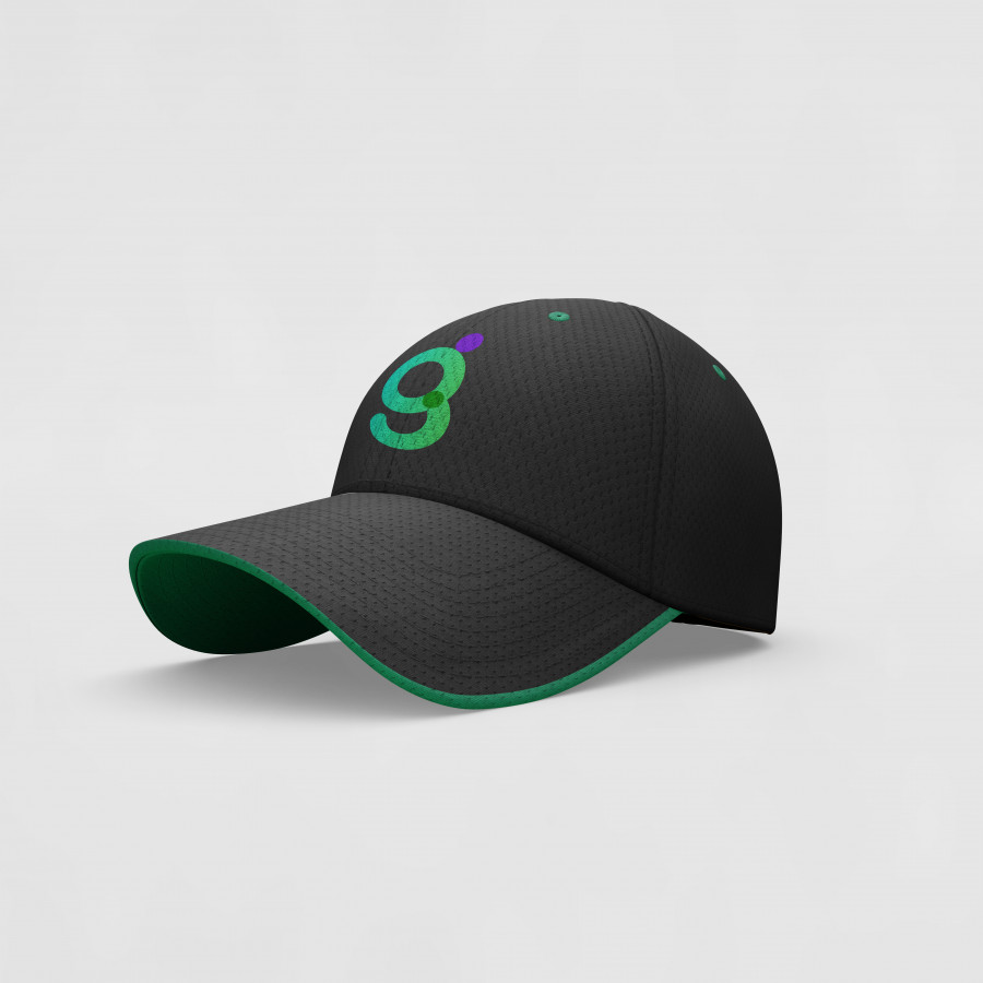
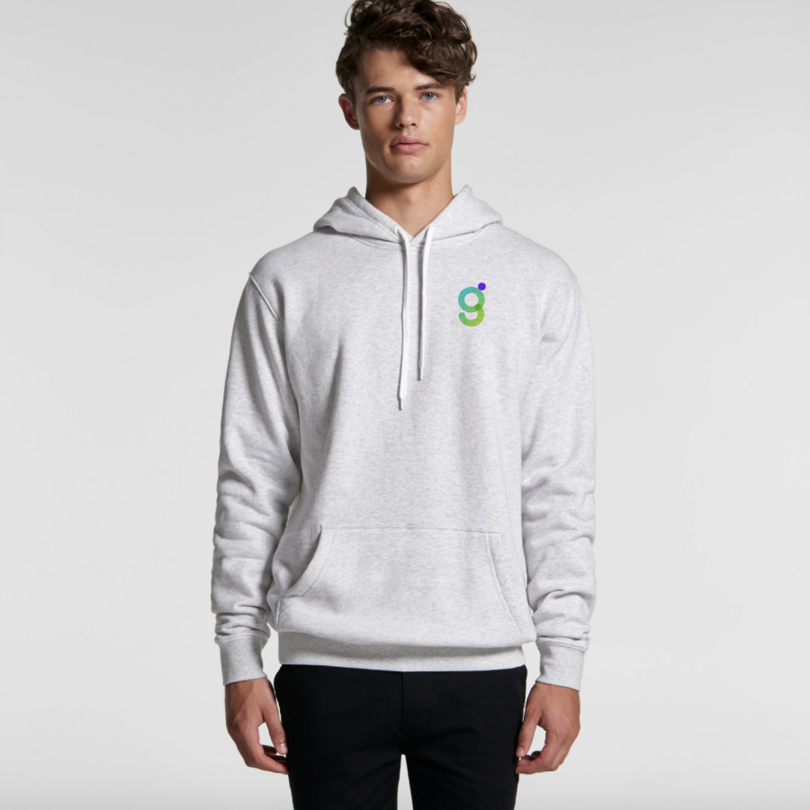
The evolution of the GetGoing brand Identity ended up being a total overhaul as the brand positioning and key messaging were polar opposite from the original. So to communicate our diverse new offerings, attract a wider audience, be gender neutral and appeal to more culturally diverse communities, we really wanted the new identity to shine ~ continuously changing and evolving. Adapting to changing environments as the business grows. The identity/logo needed to be a symbol of happiness (The smile in the ‘g’), positivity, confidence and better health; so for that reason we developed the ‘g’ mark. A shorthand way of recognising the brand and saying you are in good hands. It needed to stand its ground with conviction, invigorate people’s lives, evoke emotion and most of all we wanted to challenge people to think a little differently about their health and wellbeing and place a level of importance on it. Because their health is worth it.
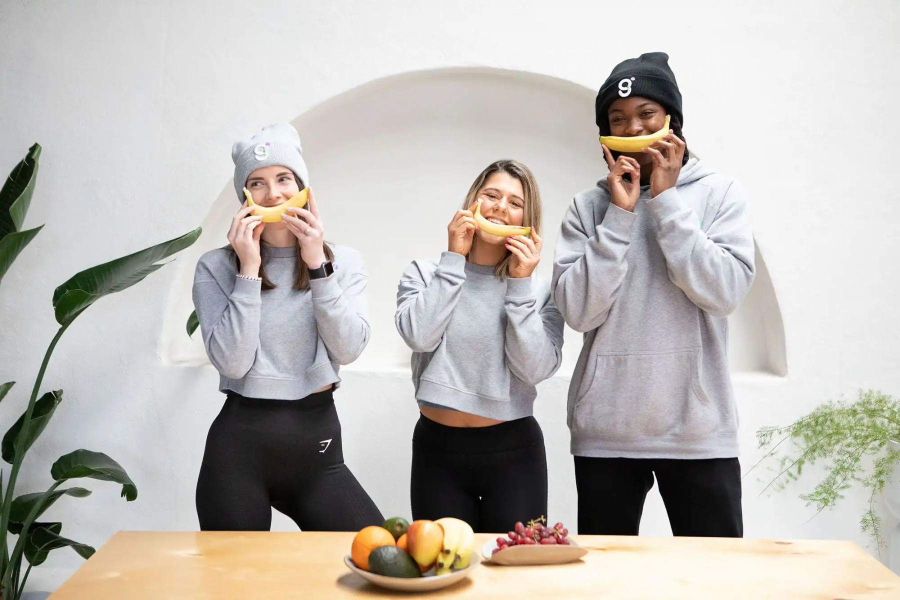
After considerable adaptations and creative directions, we designed a very youthful and colourful brand Identity that really spoke to everyone. It struck the right balance of playfulness, yet maintaining a serious and supportive undertone through our brand language. Both equally as important to each other to communicate our key brand message.
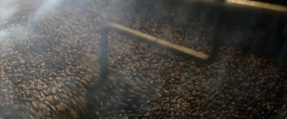
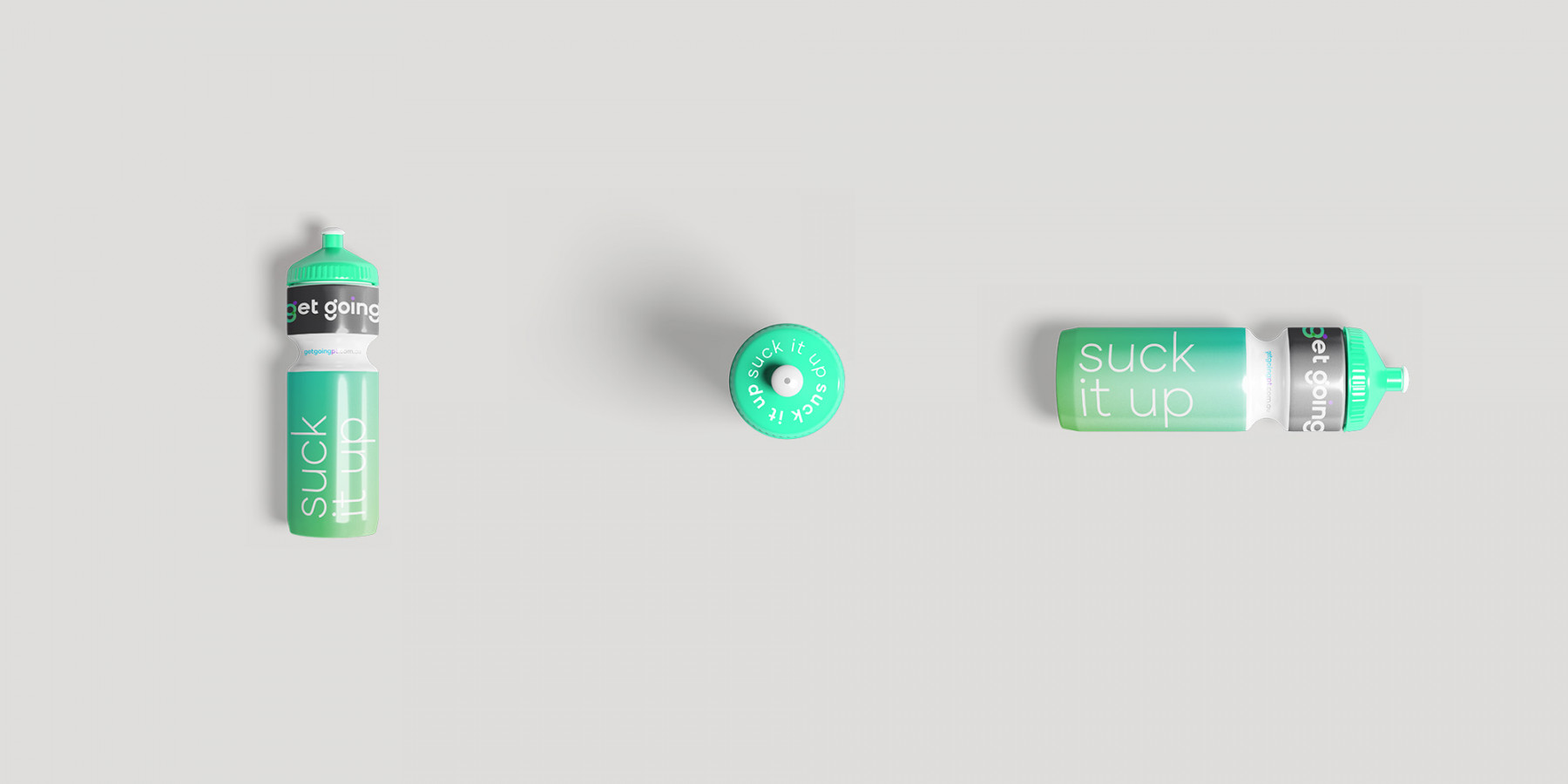
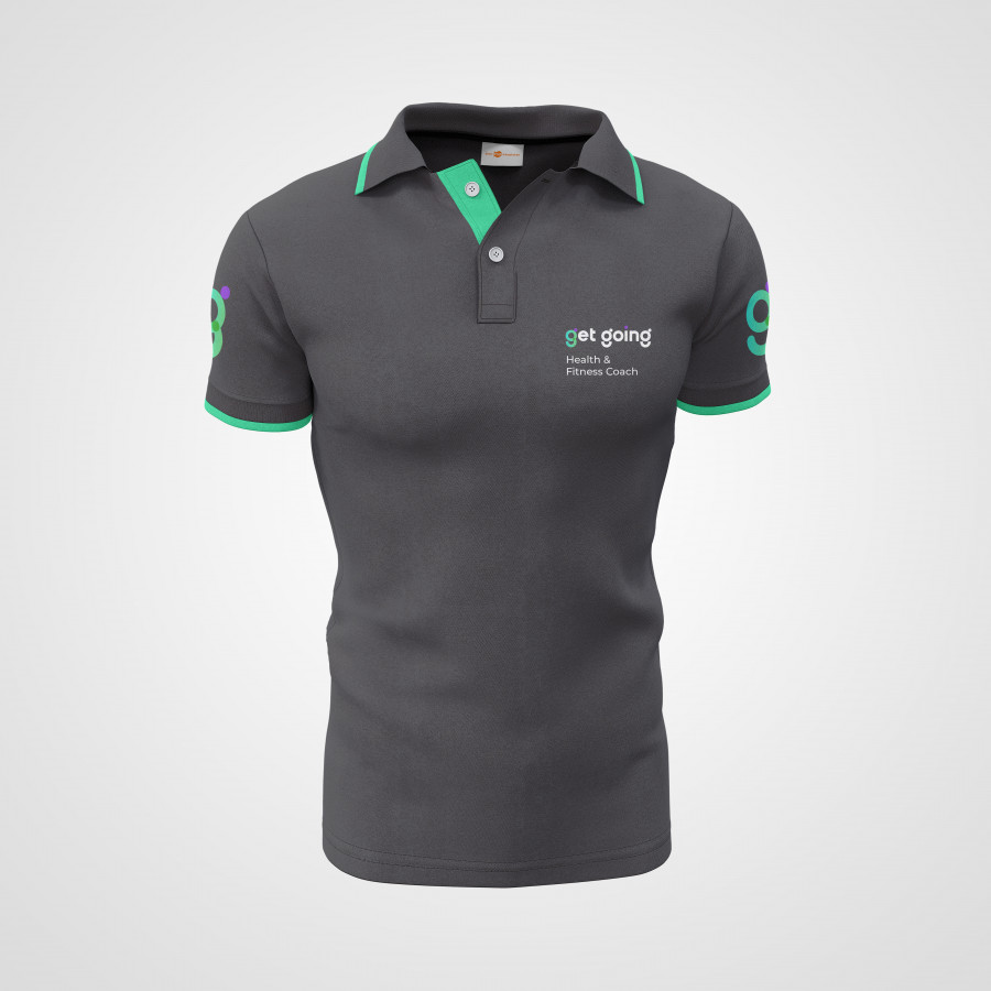
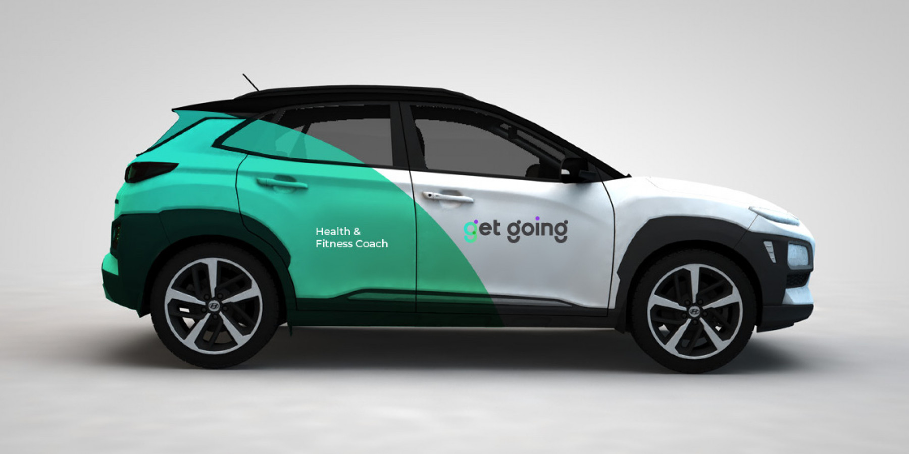
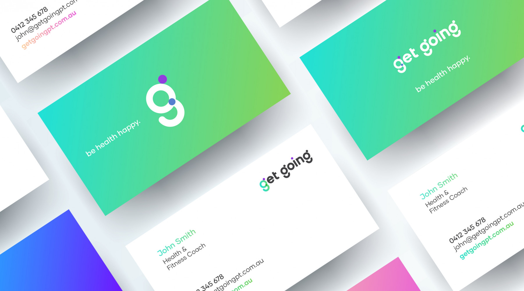
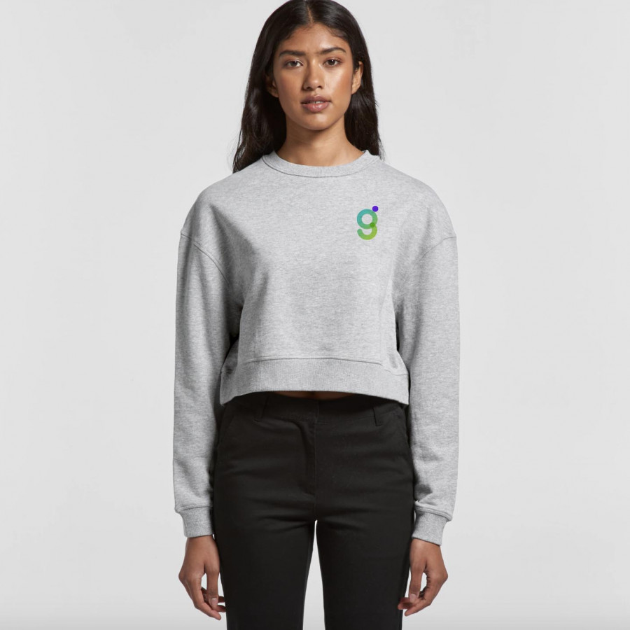
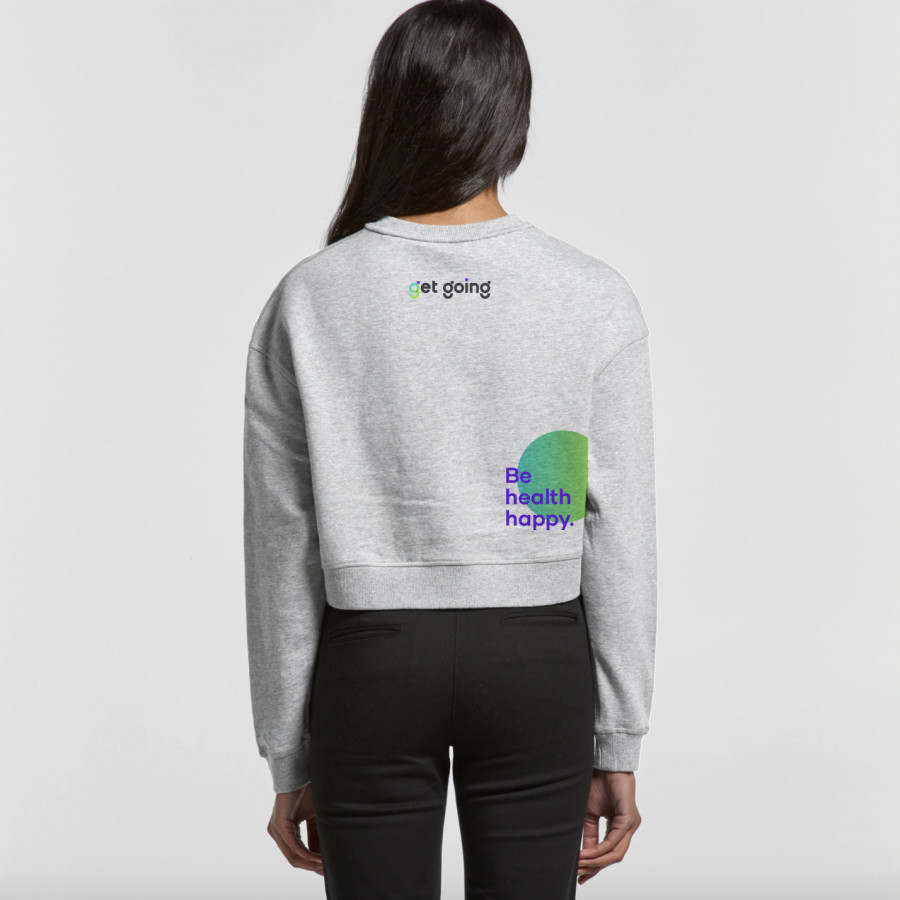
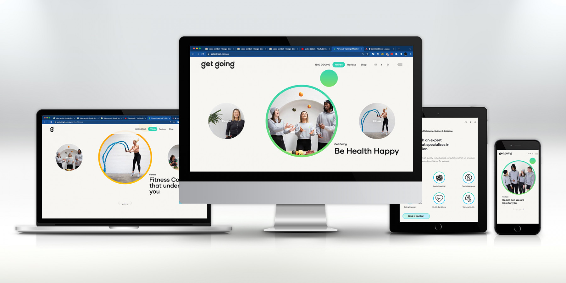
We created a bespoke style and treatment for imagery and photography, designed various colourways and complimentary colour palettes depending on the environment in which it was seen in as well as a proprietary typeface that helped communicate the openness and friendliness of their coaches. From stationery, brochures, uniforms, livery and signage, right through to their website, EDM’s, motion pieces, SEO/SEM, e-shop, socials and promotional products ~ the ‘g’ vibe was starting to gain momentum, getting eyeballs and a new wave of energy was sweeping the health and fitness space. Everyone was really feelin’ the ‘Be health happy’ message.
Explore more work